Traditional Art
Throughout the past couple of years, I have attended several traditional art classes for my Graphic Design degree. The following are my works made in mediums such as pencil, ink, and painting.

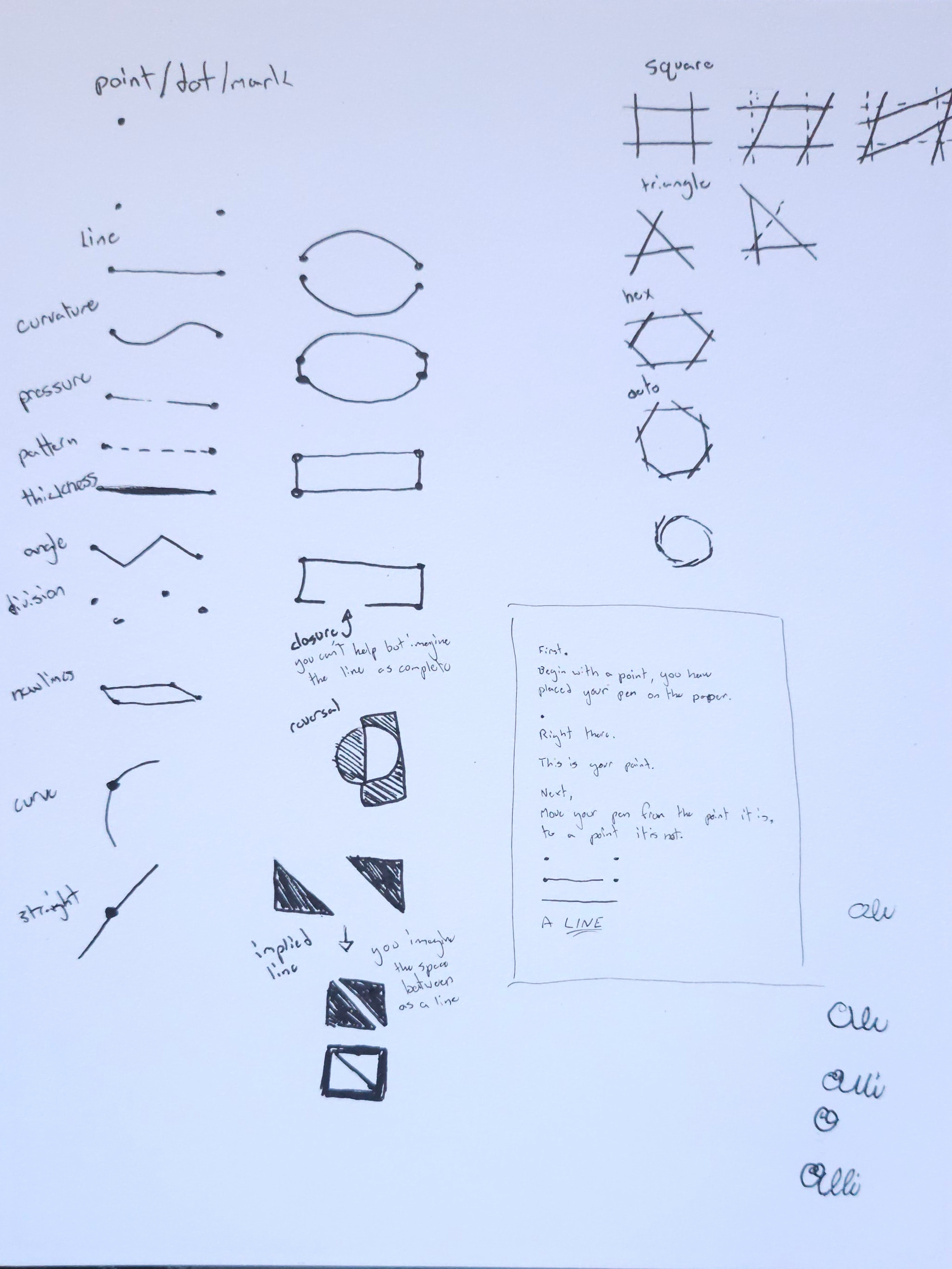
Foundations of Drawing
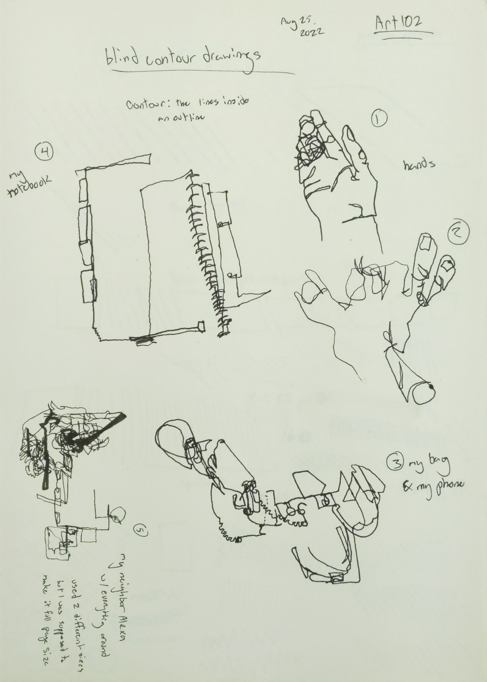
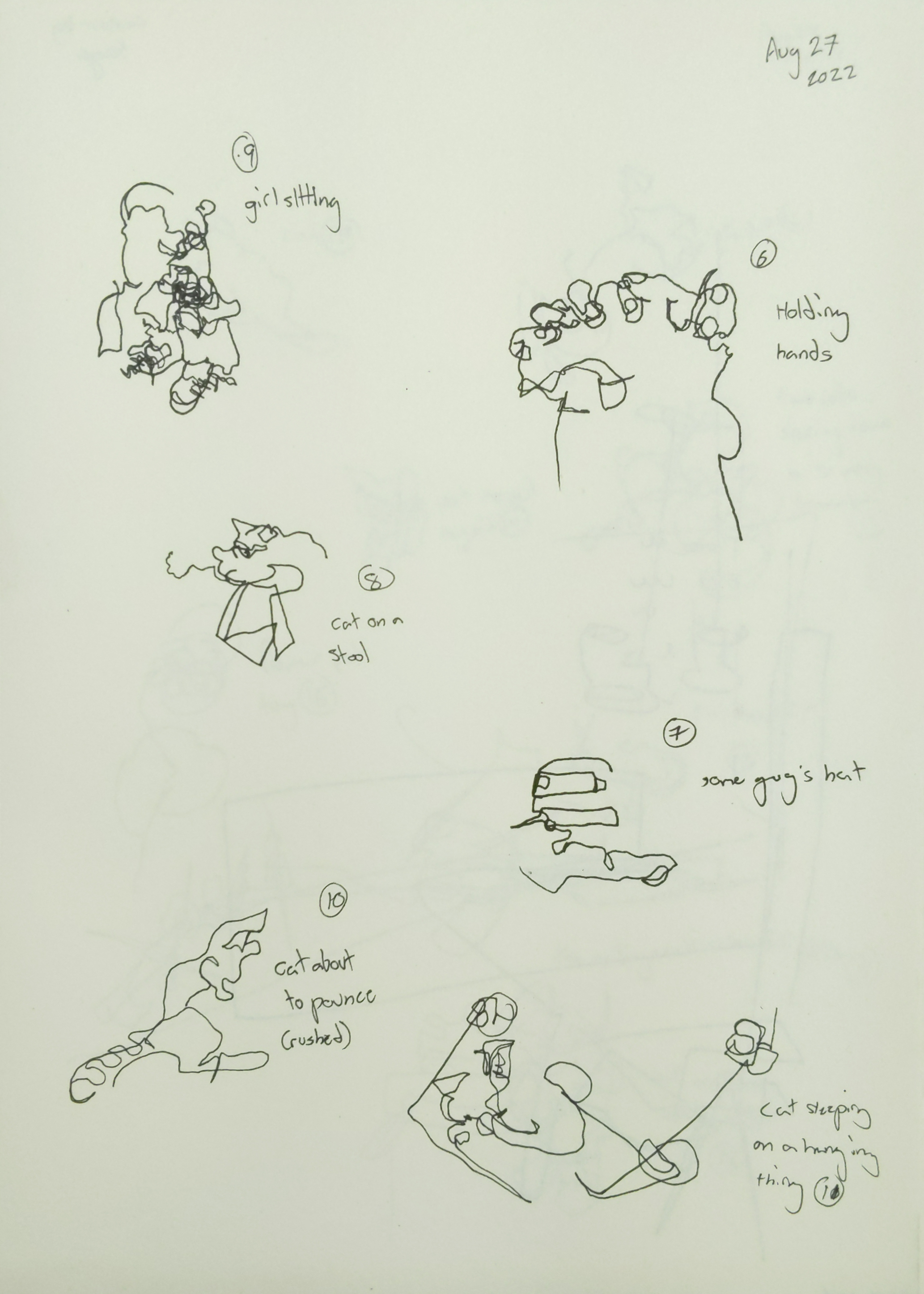
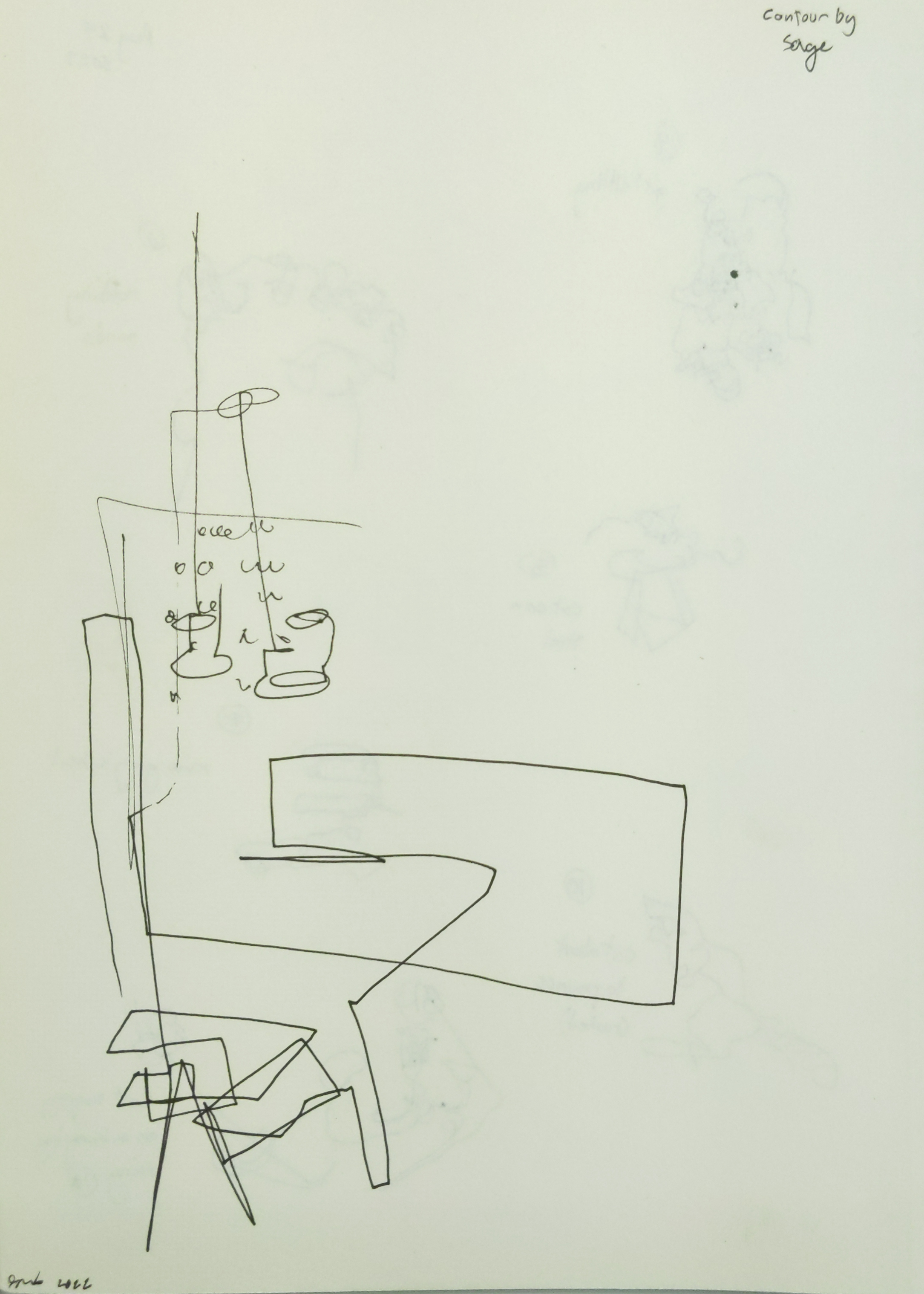
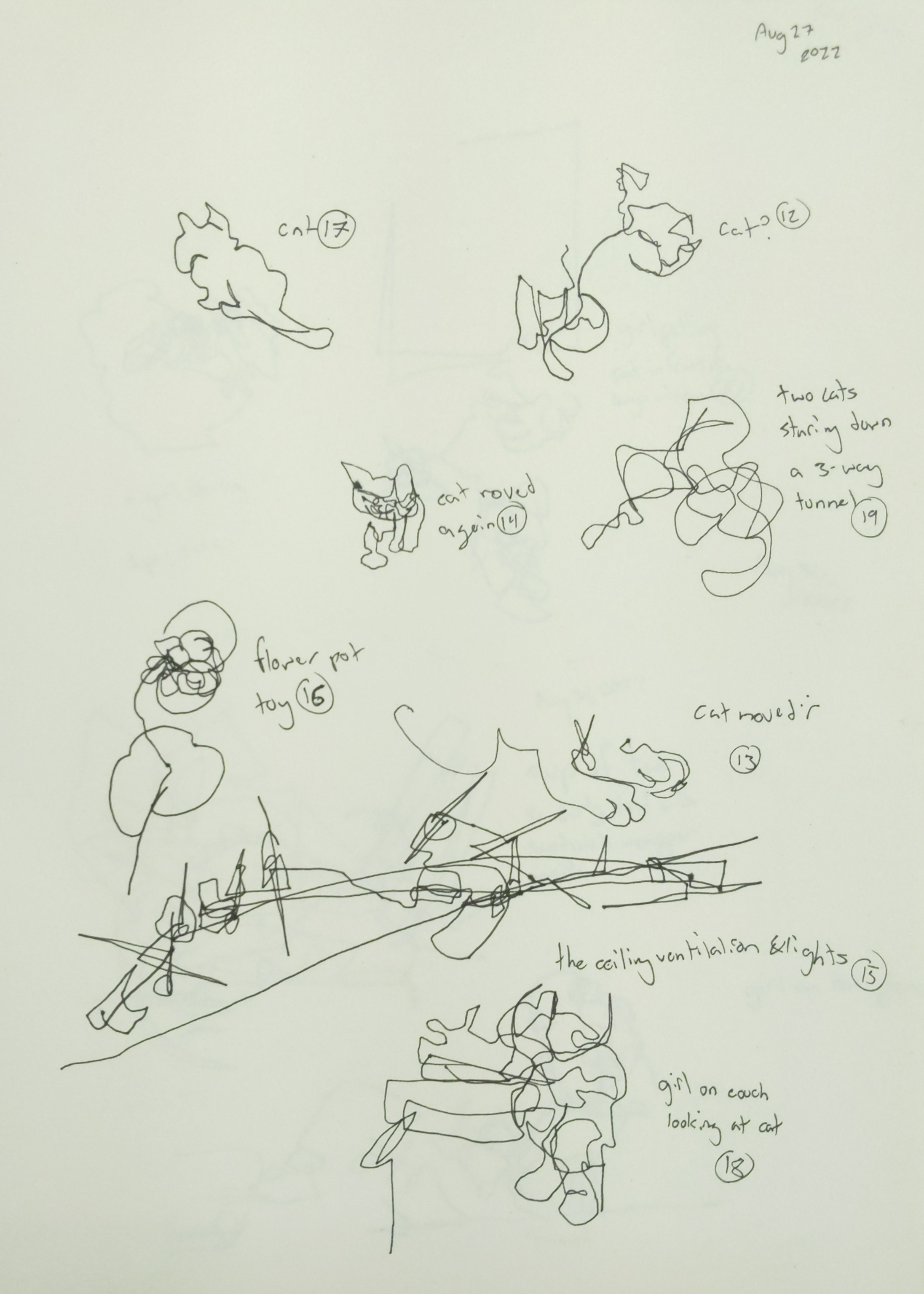
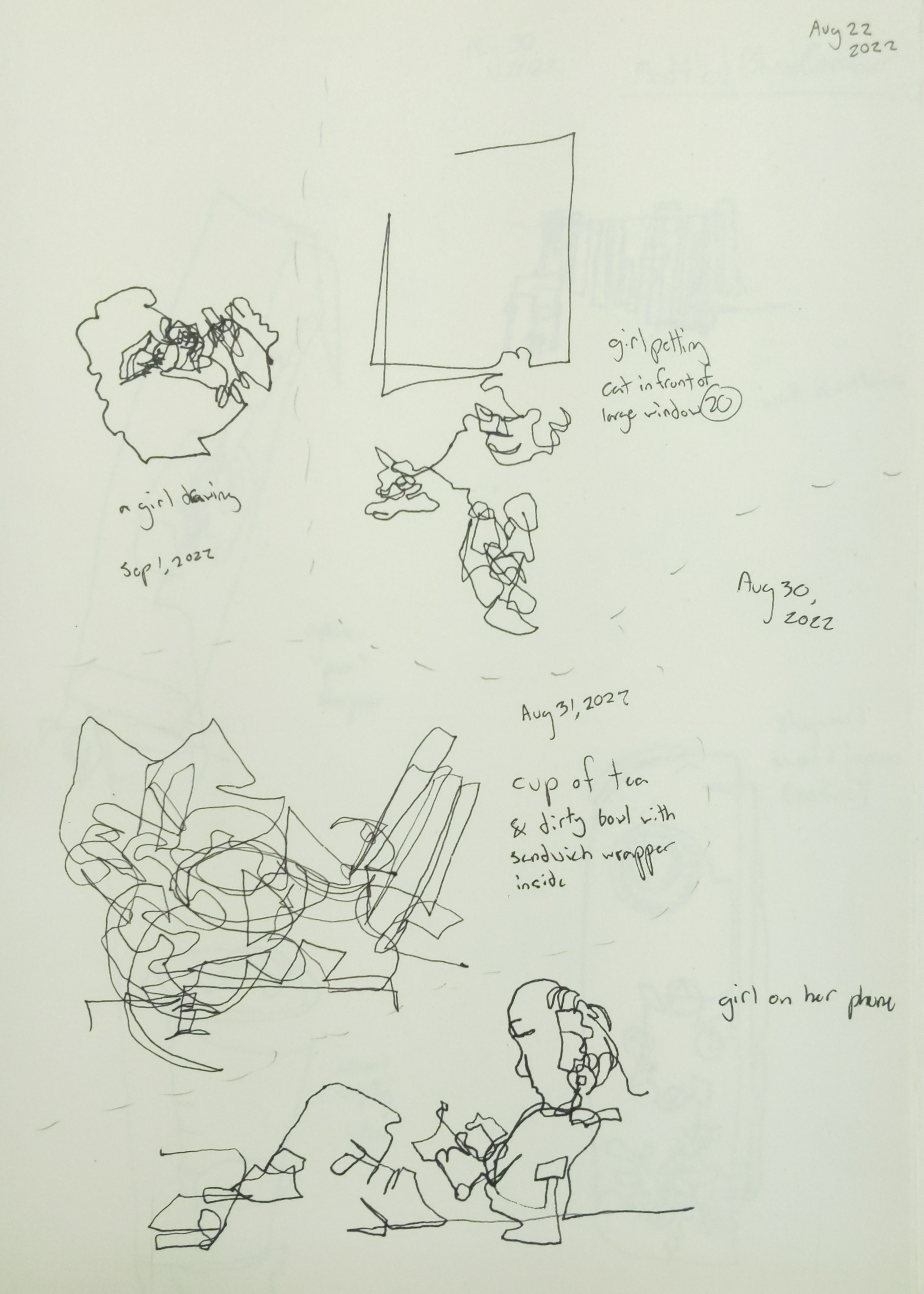
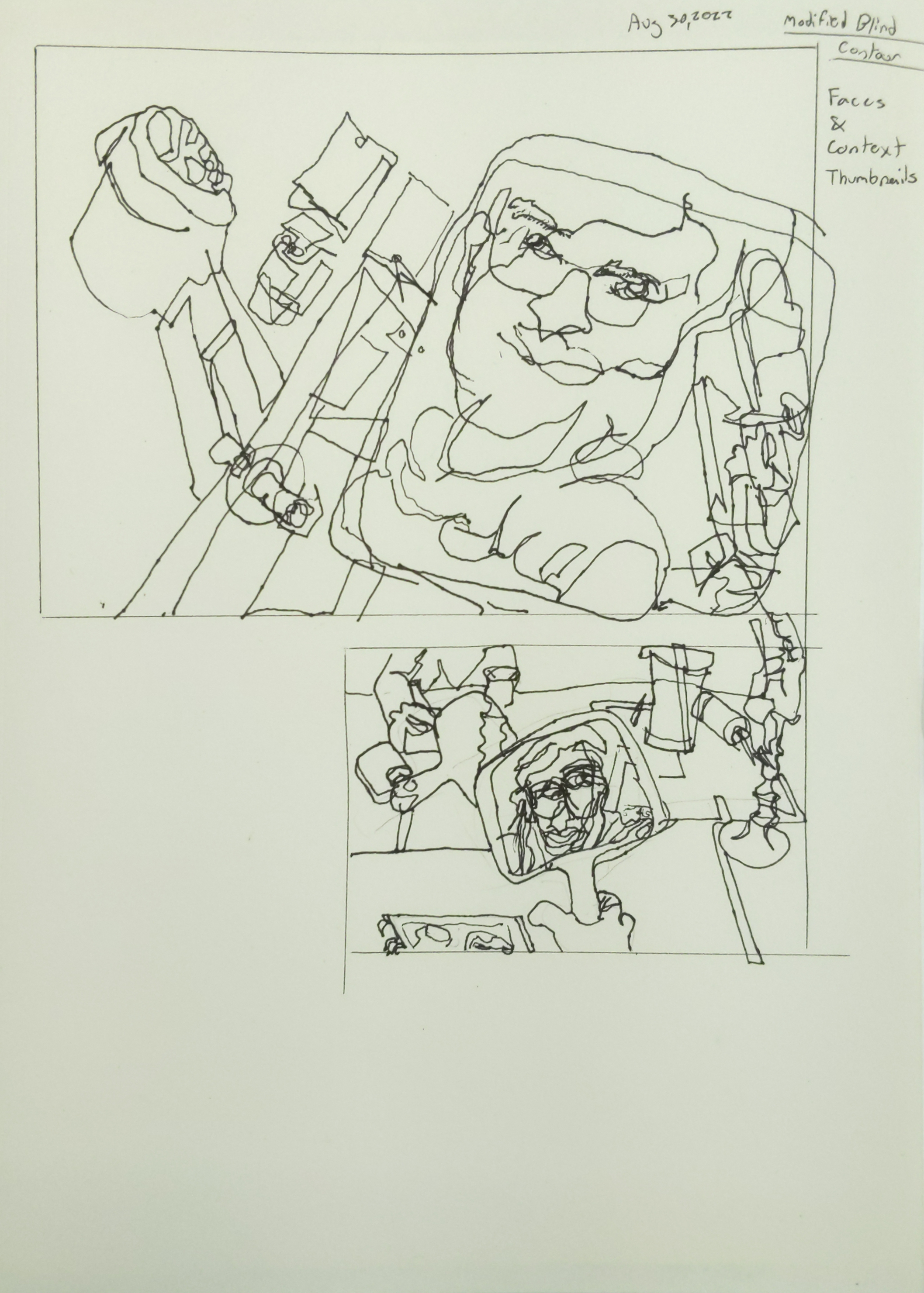
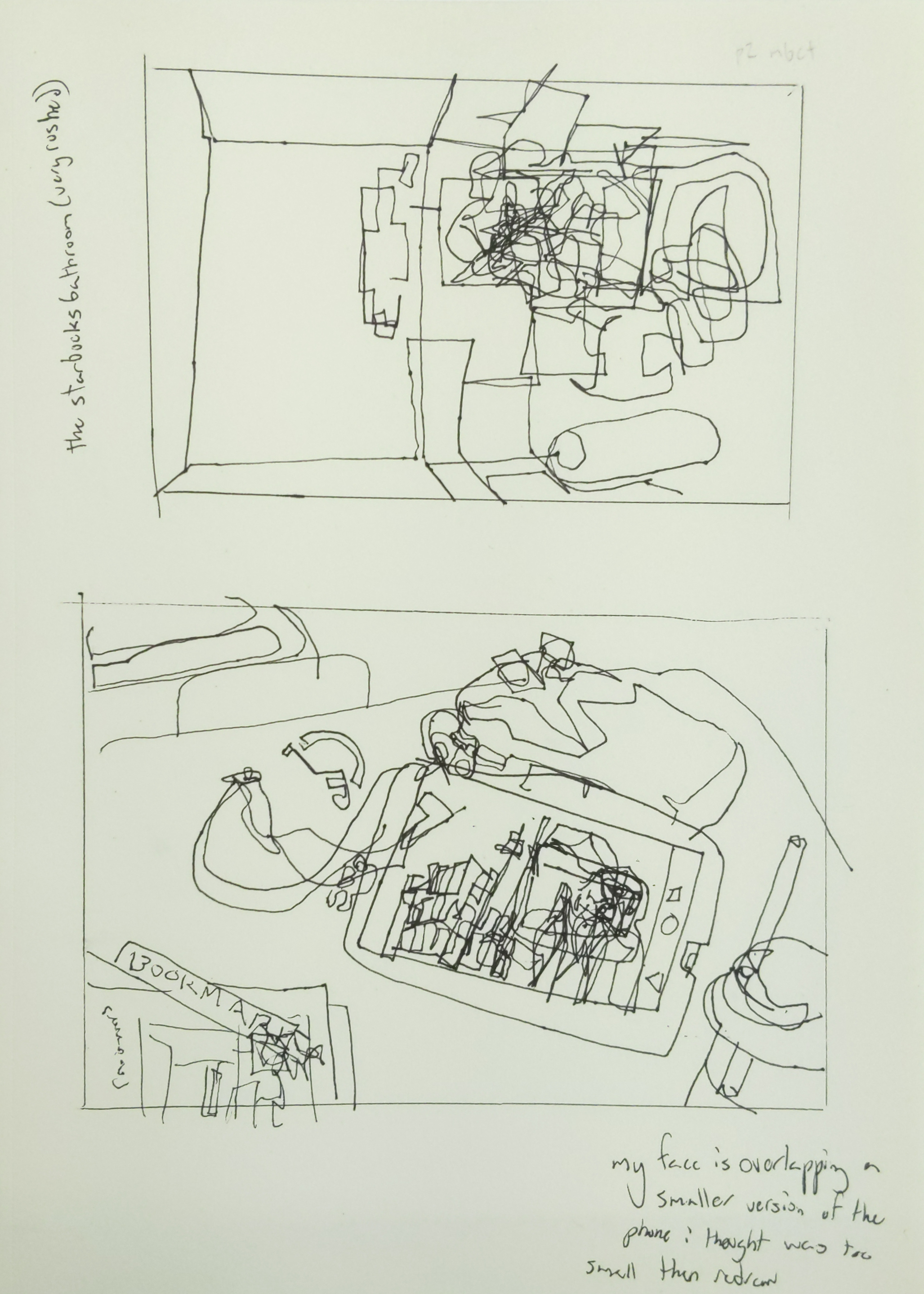
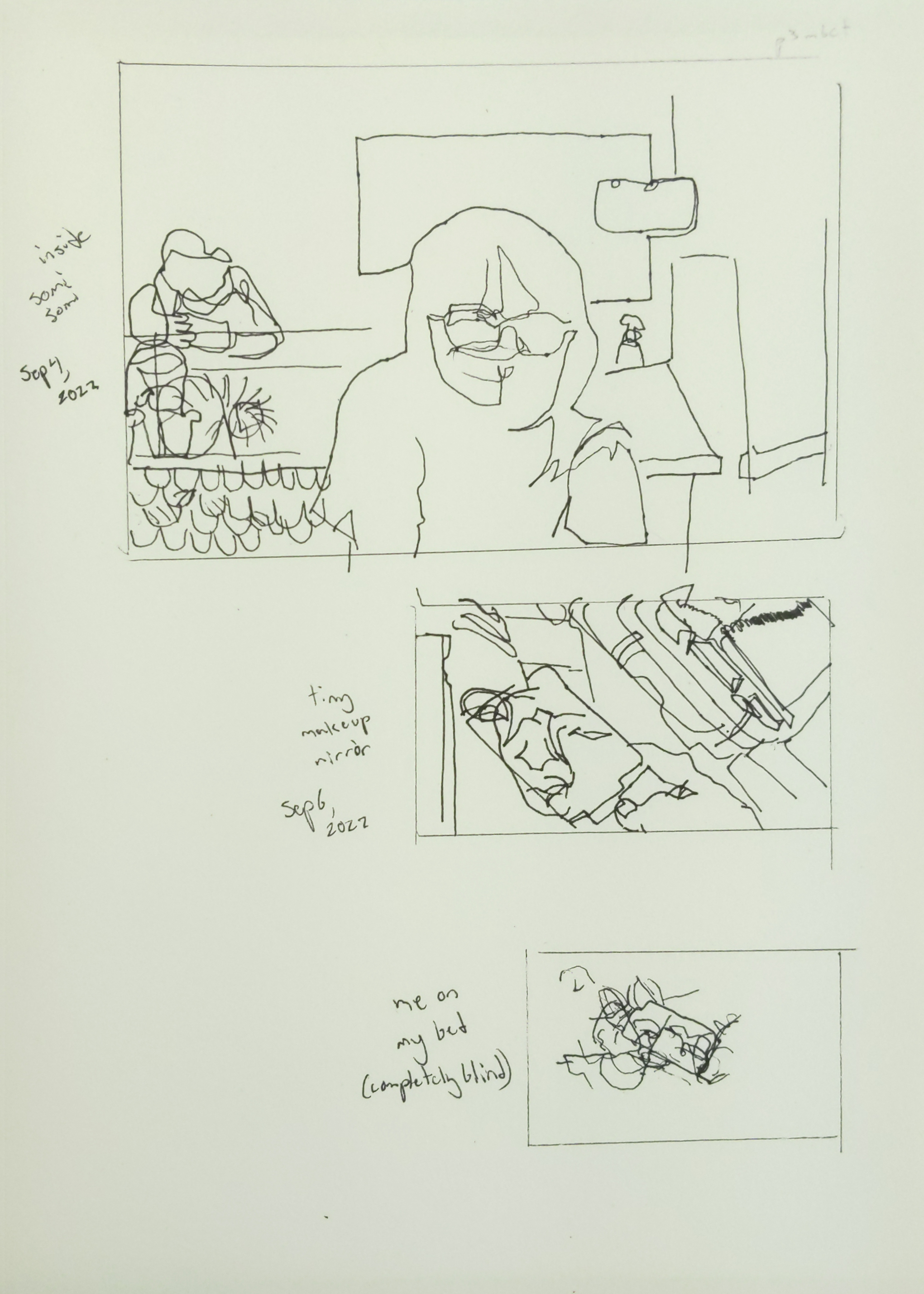
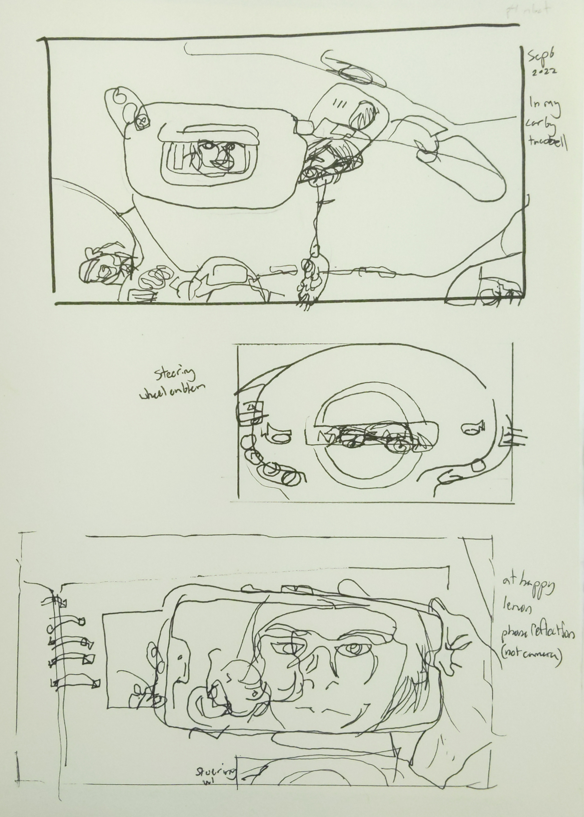
Blind Contours
My very first art assignment at Palomar: I had always heard of the importance of silhouette growing up, but it wasn't until this assignment that I really began to understand it. This also taught me the important lesson of appreciating my own art even when I can't make the final product appear exactly as I envisioned it in my mind.

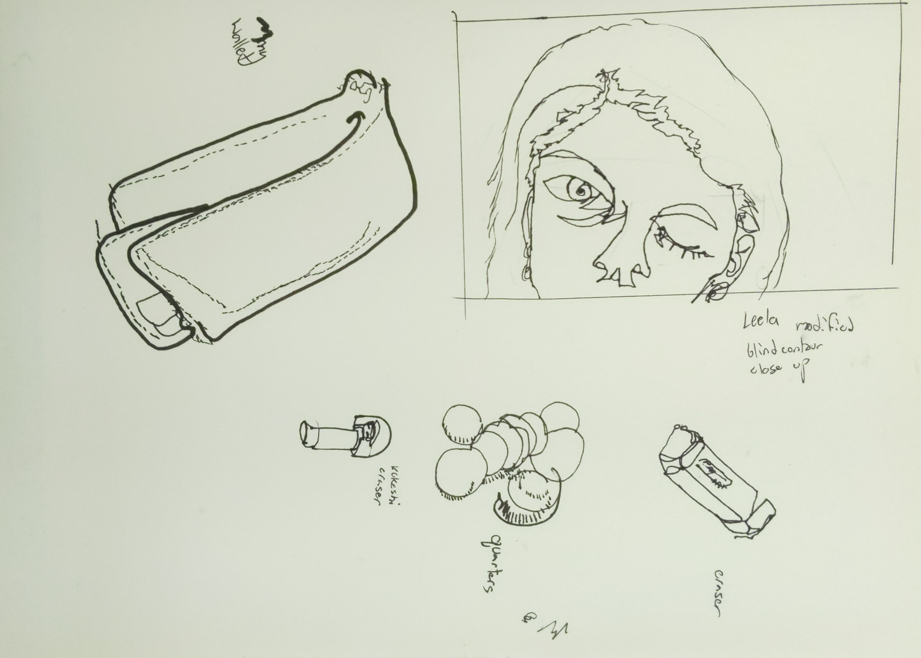
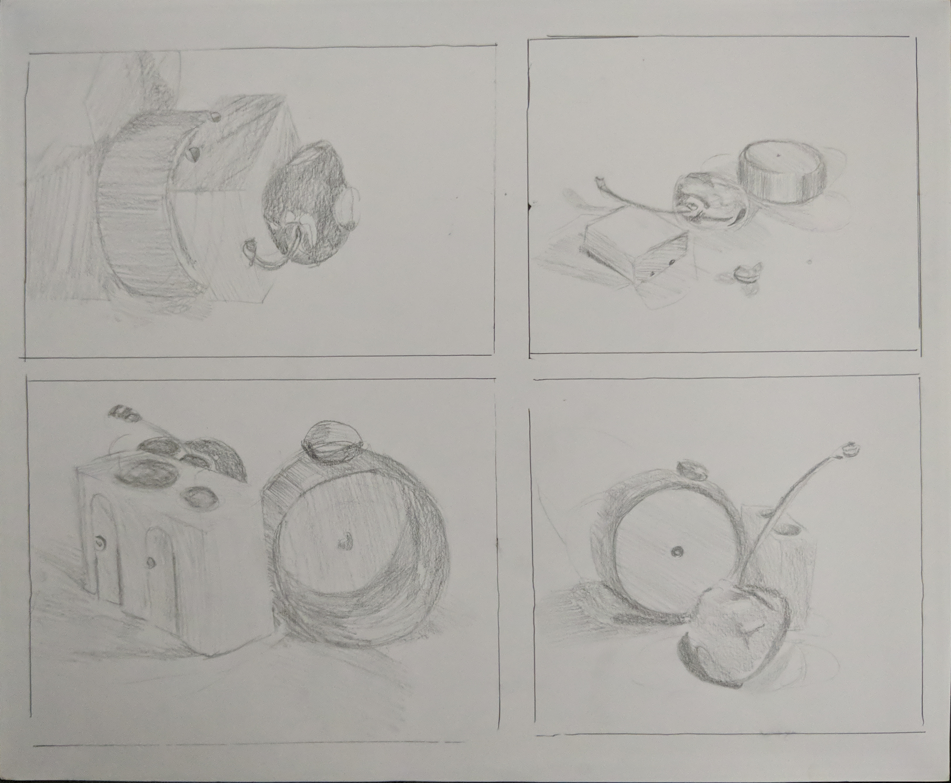
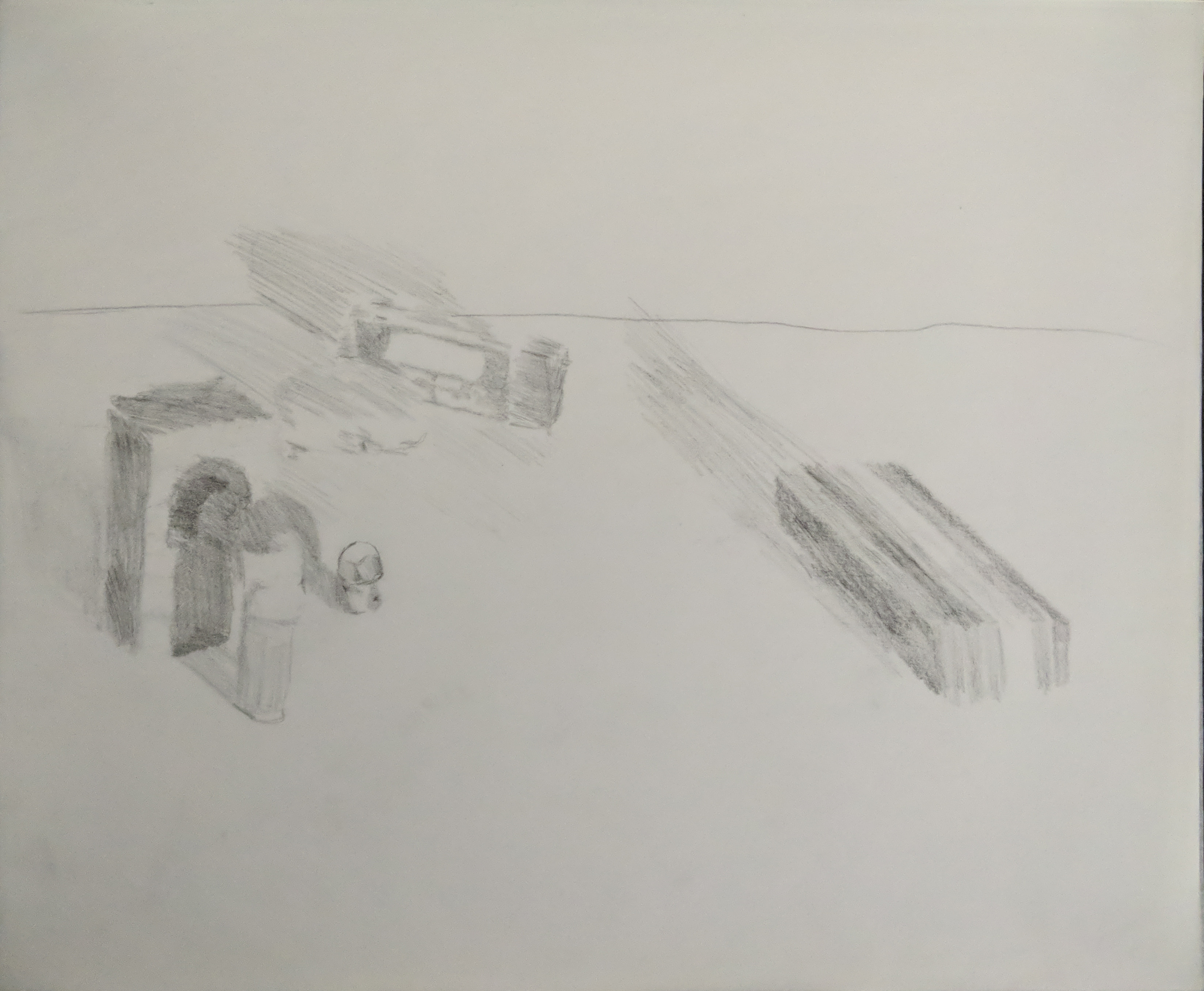
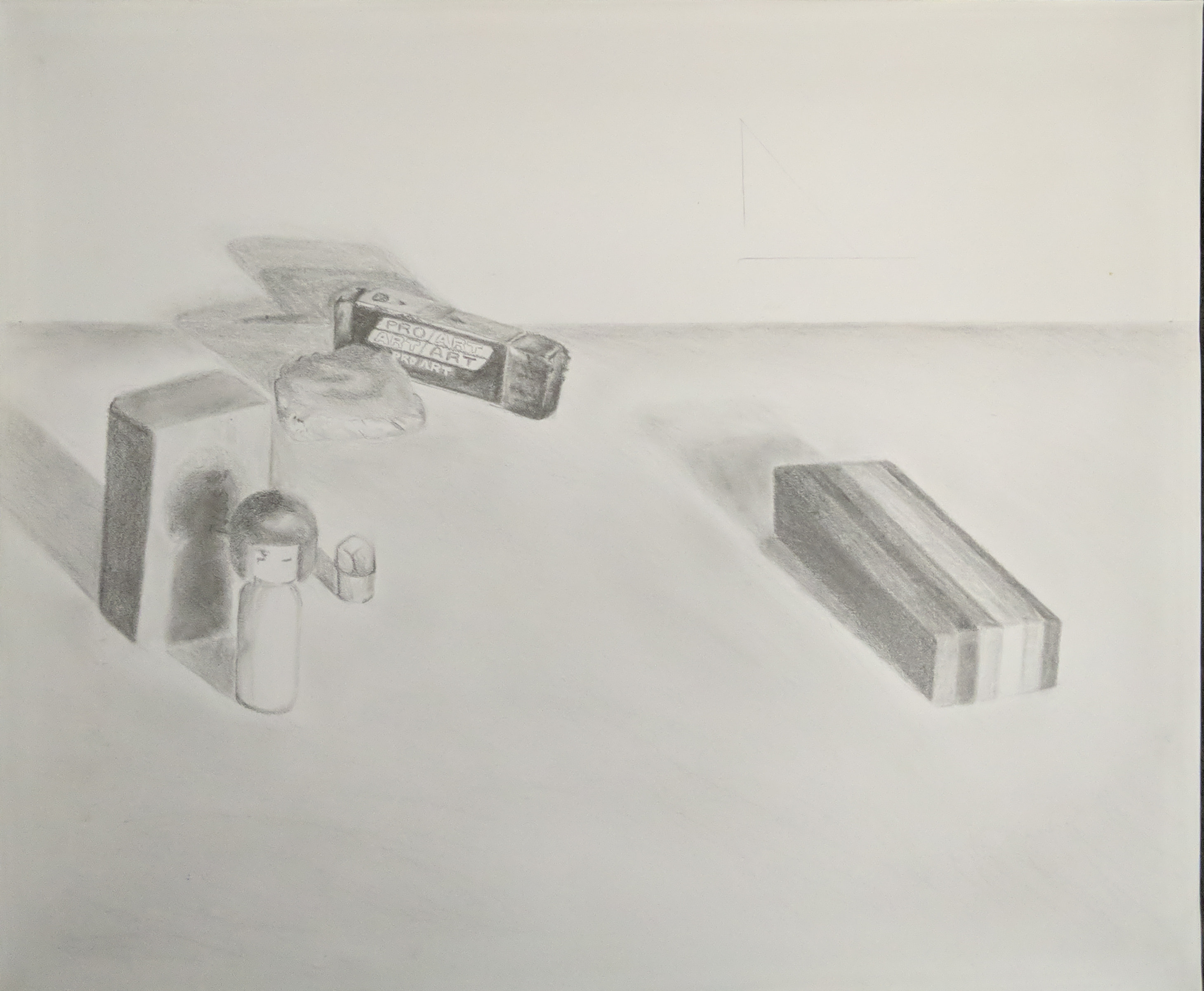
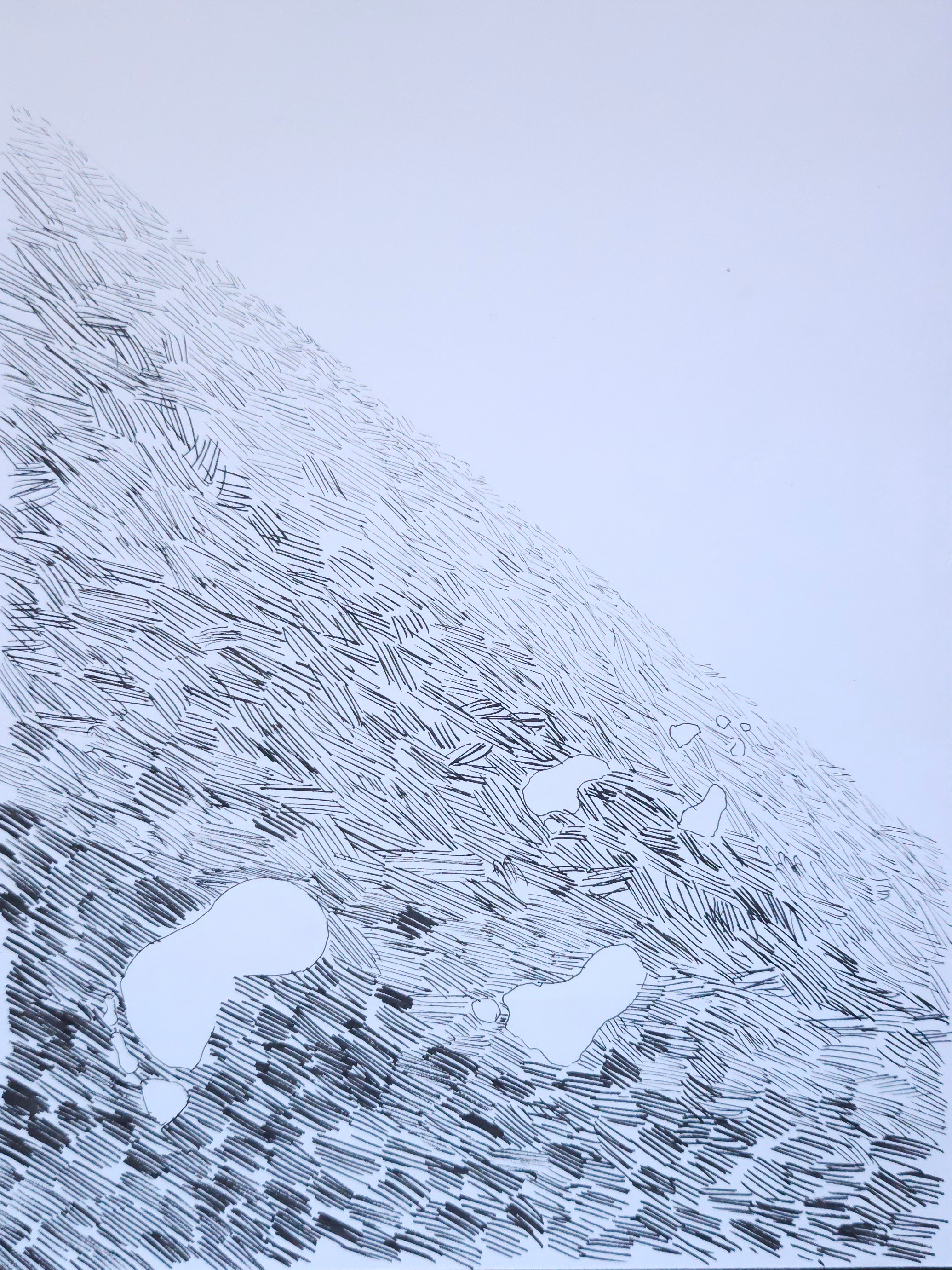
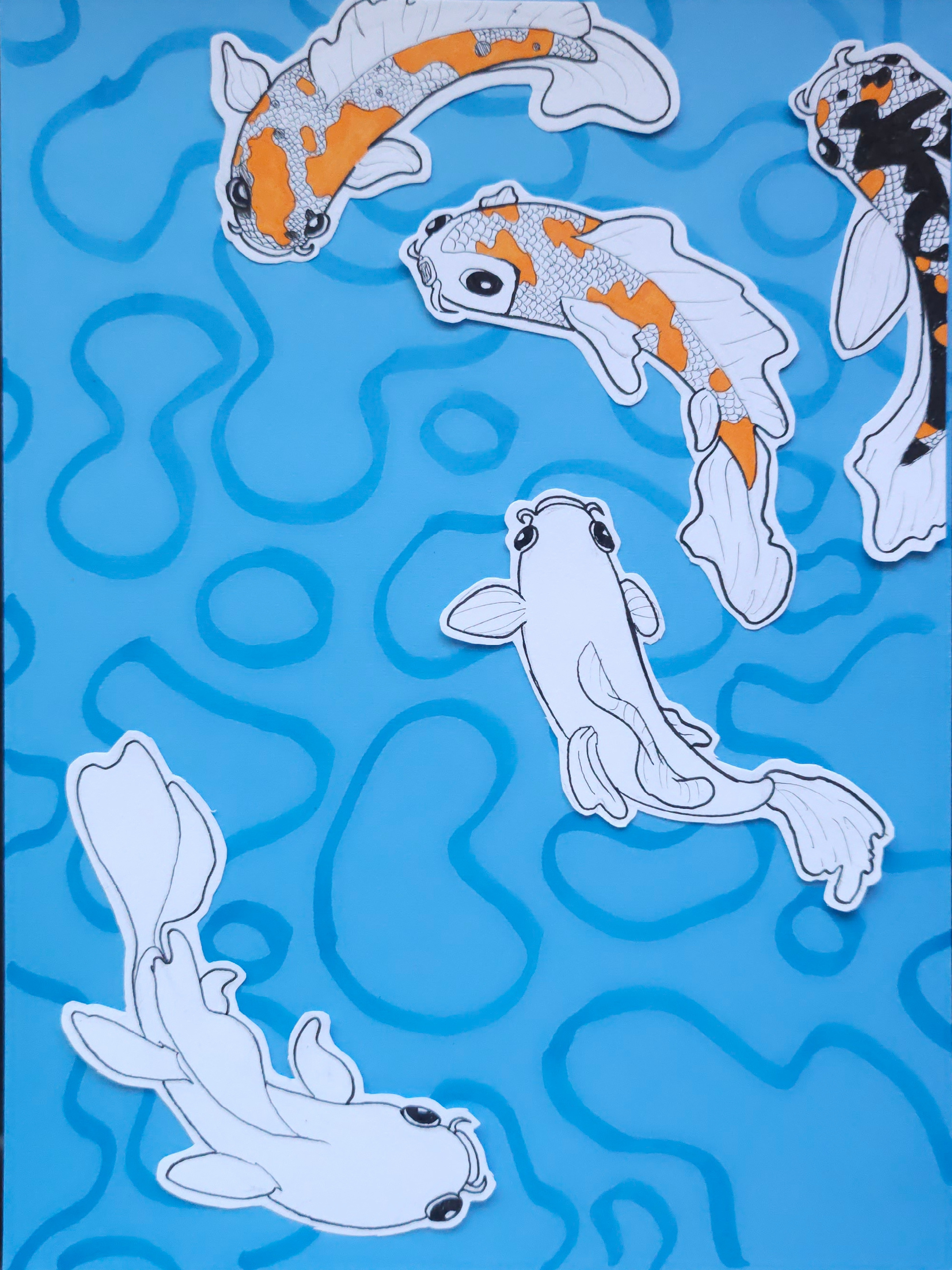
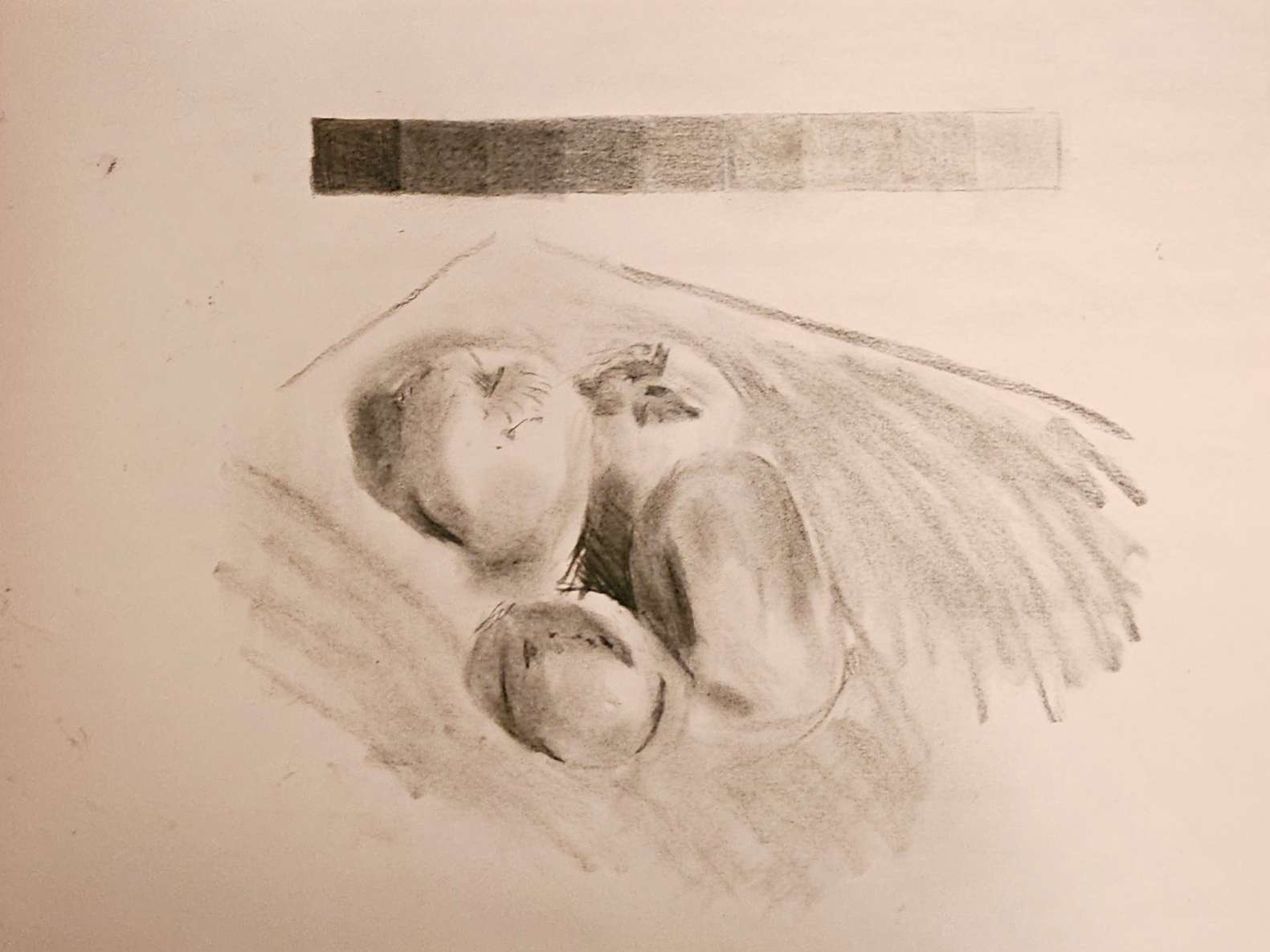
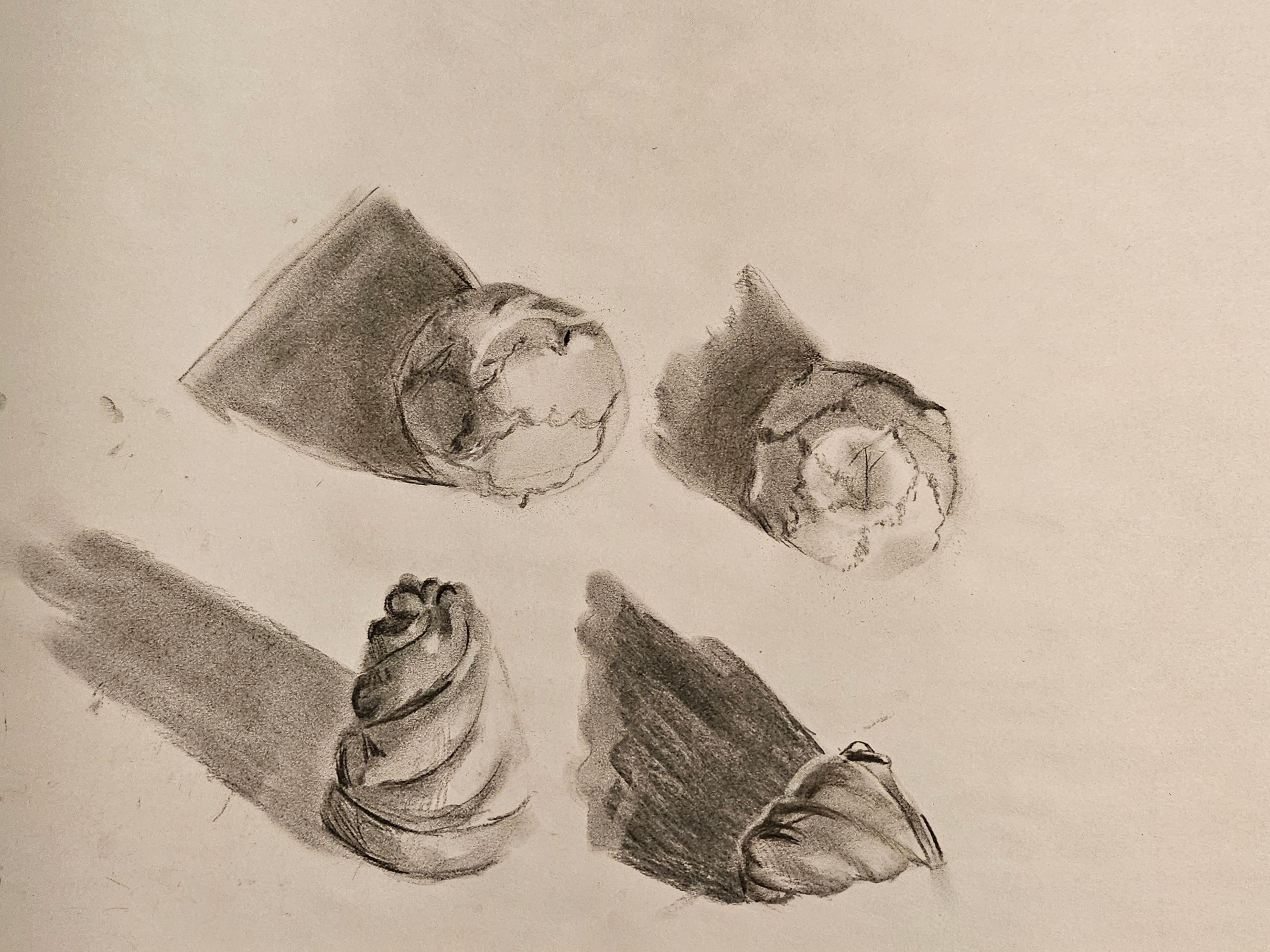
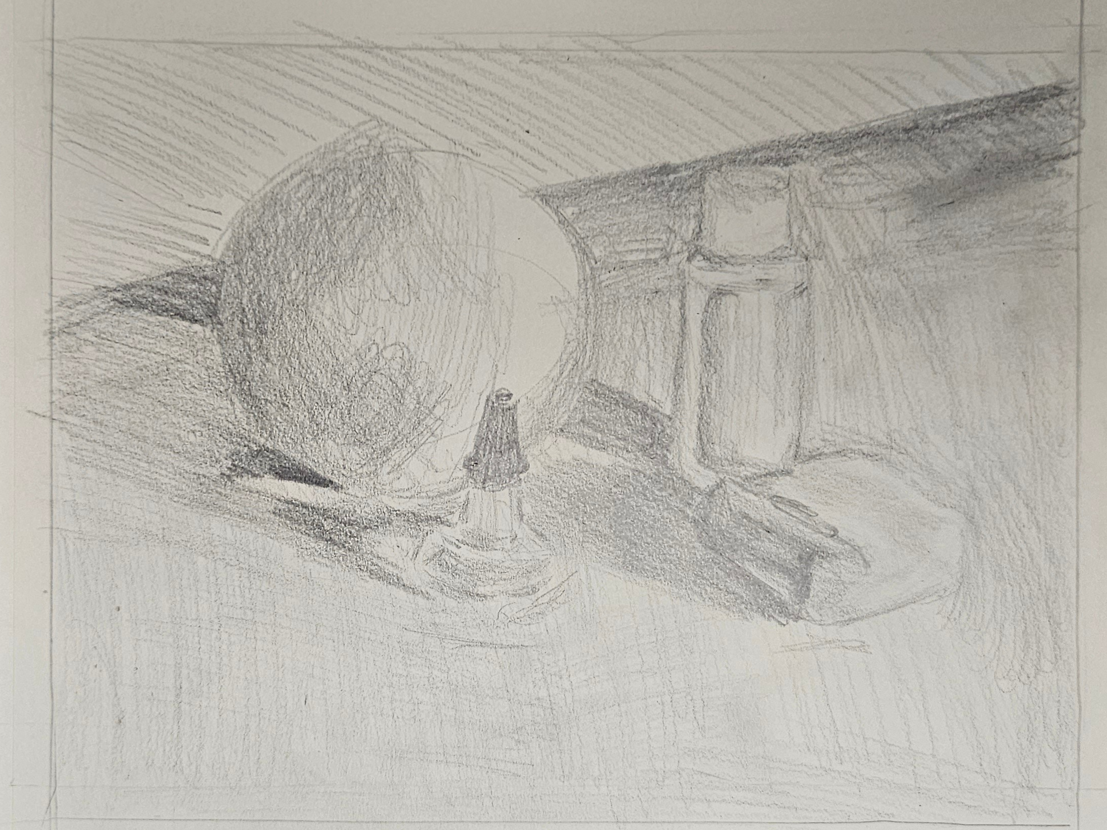
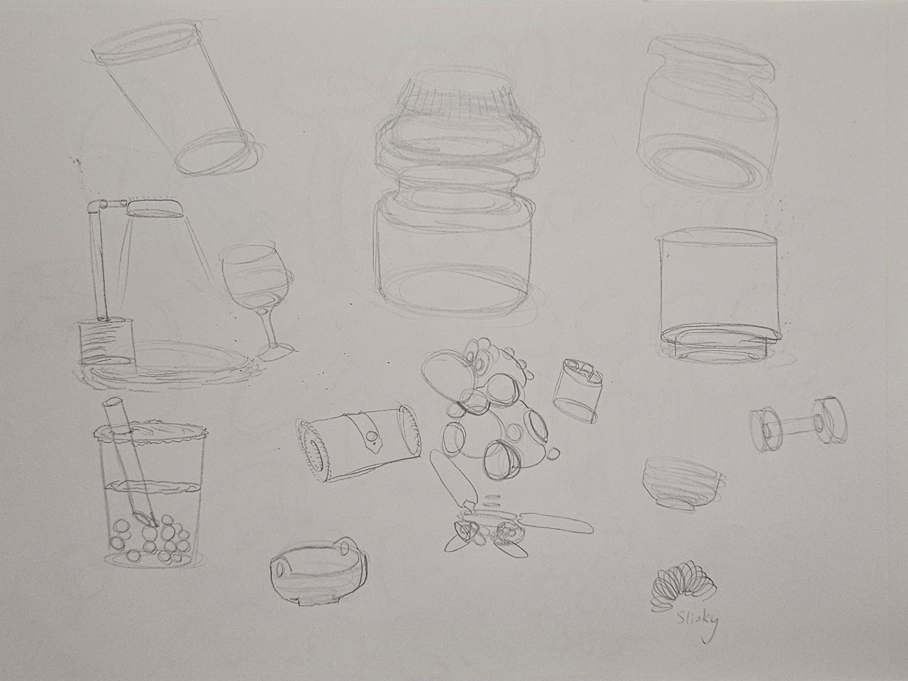
Observational Still Lifes
As part of learning the basics, I drew still lifes of whatever I could find around the classroom. I chose to theme my still lifes around erasers. The final compositions tries to guide the eye around the frame using the golden ratio. Your eye should trace a spiral as you examine the drawing.
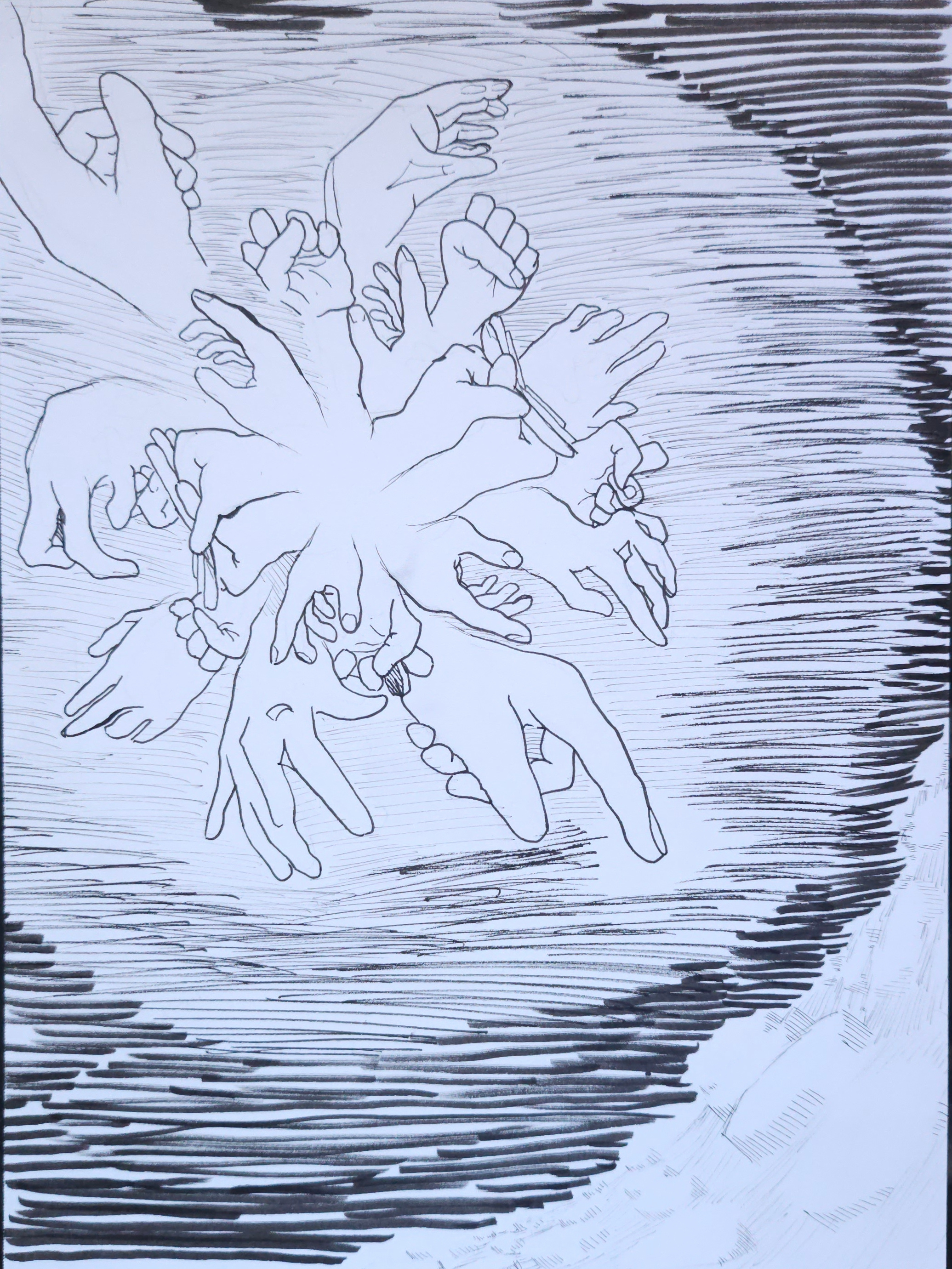
Human Nature Relationship
In line with the assignment title, I chose the subject of a human hand holding a newborn puppy, while the pup's Momma watches proudly. This was my first time working with "white" charcoal, it was a learning process to work with lightening tools as opposed to darkening.
Sadly I no longer have the reference for this piece.


Design and Composition
Handmade book
The overarching assignment for this class was to make a booklet of art that showcases all the fundamentals taught in this class. This was definitely the most intensive class during my time at Palomar. I wish I could have made this booklet with a more cohesive style, which means I need to plan style-elements at the start of my designs more thoroughly.

.jpg)
.jpg)
.jpg)
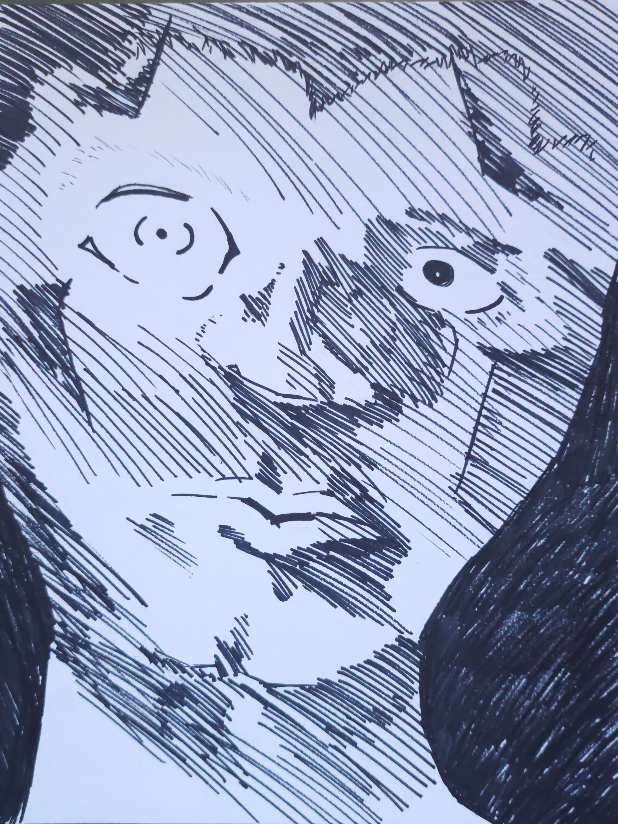
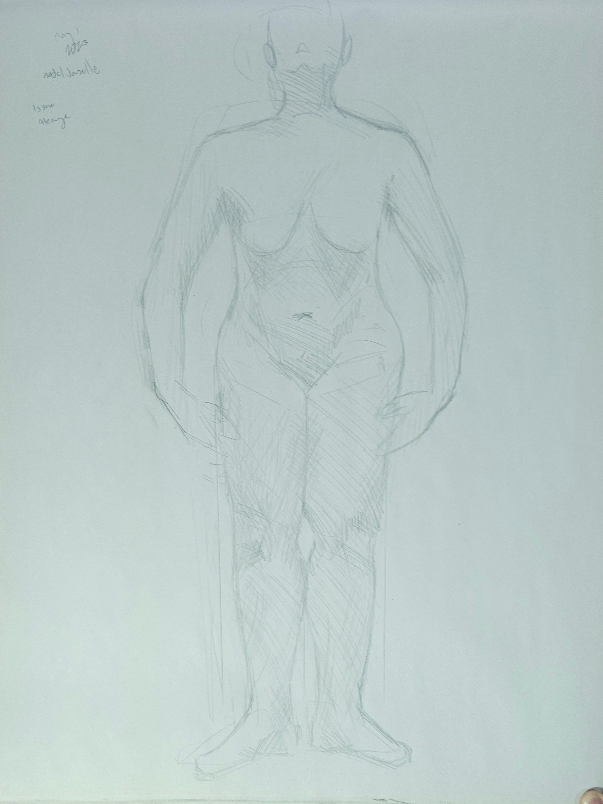
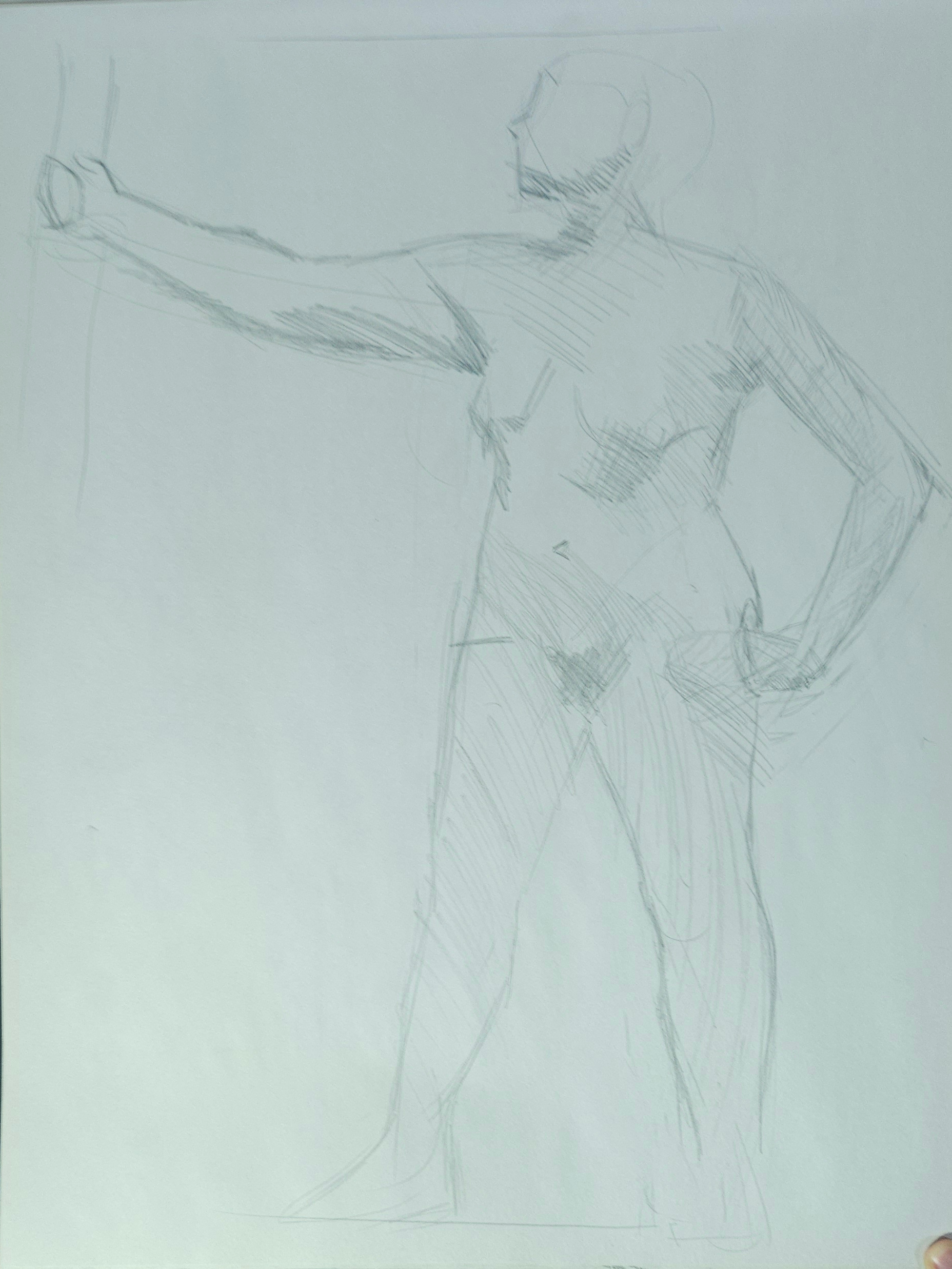
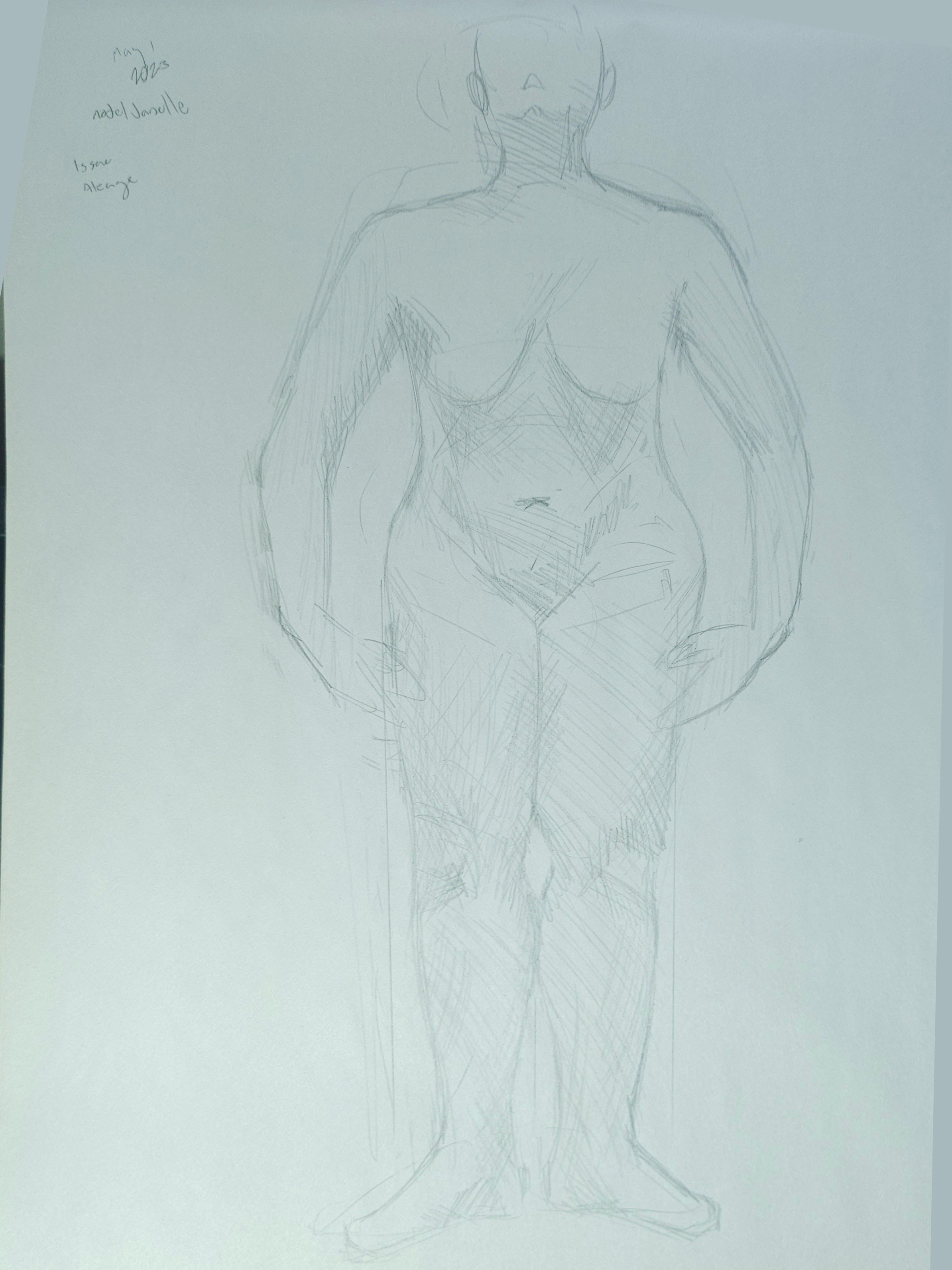
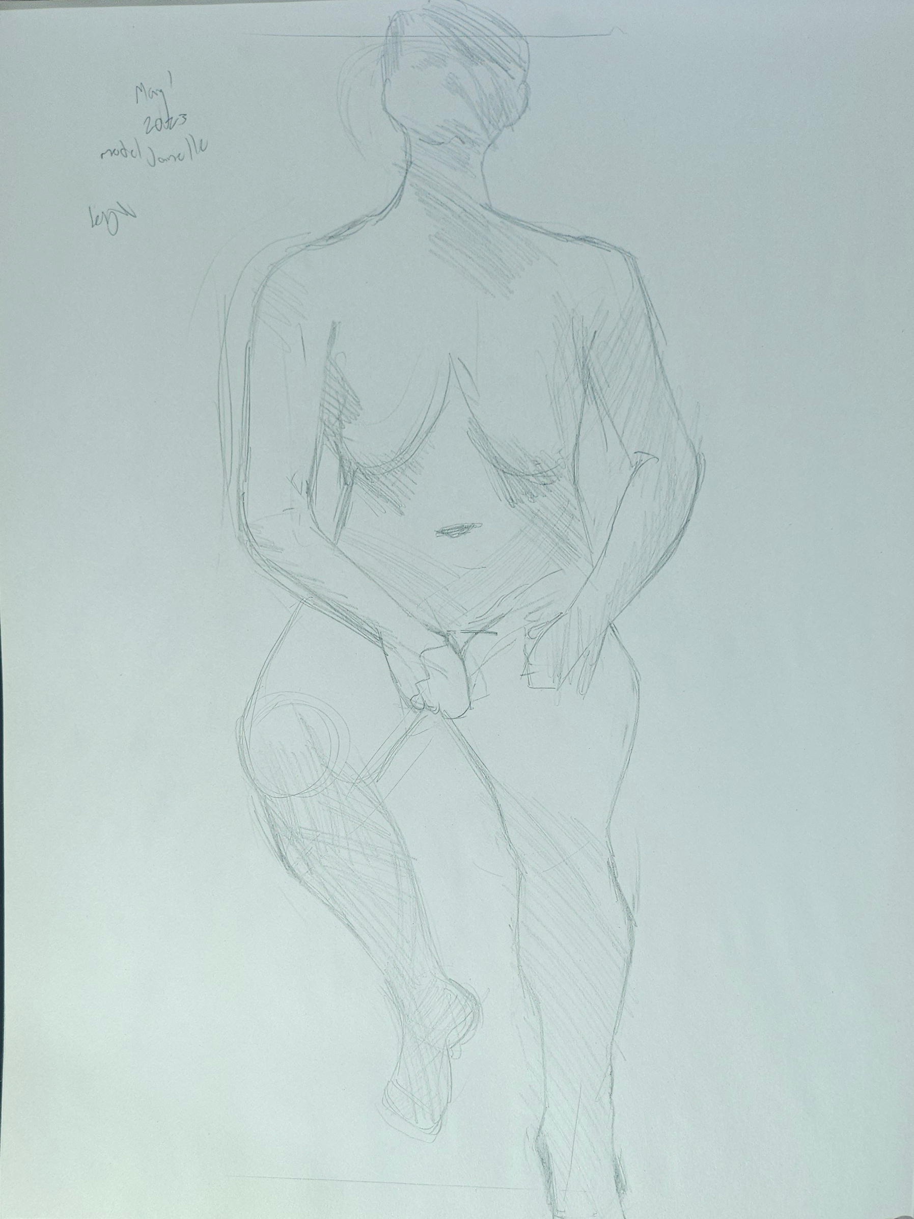
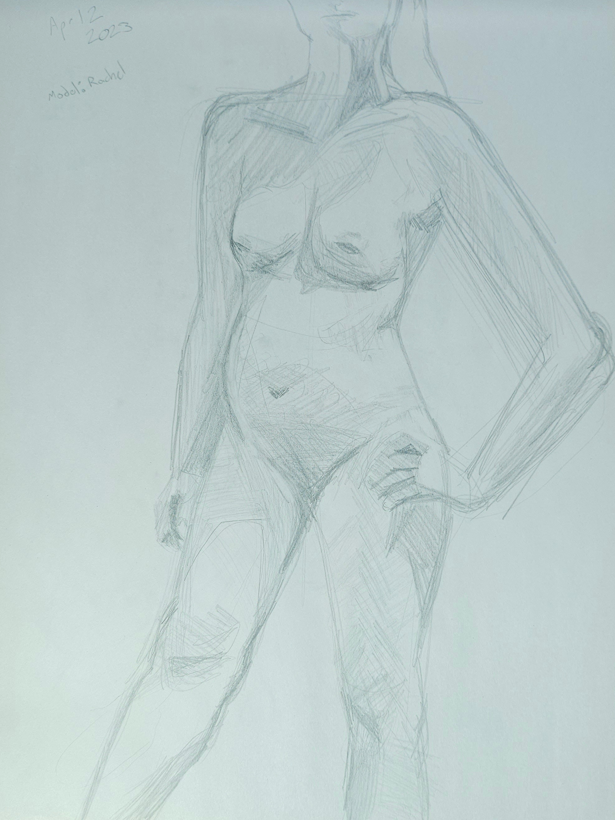
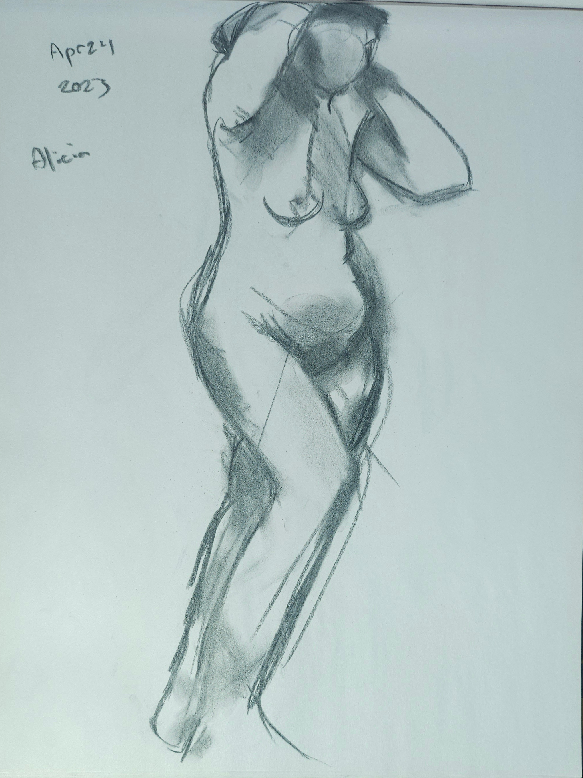
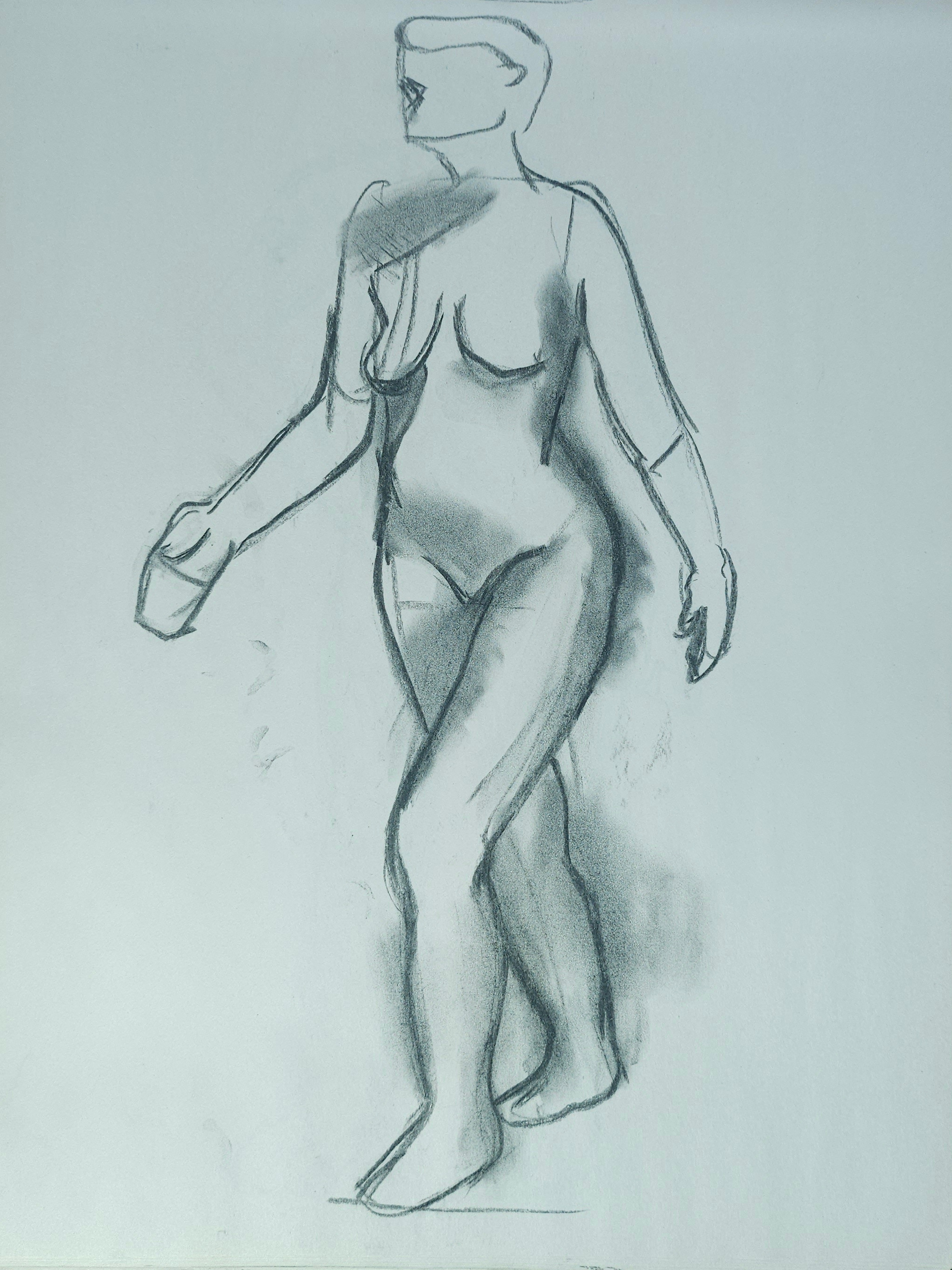
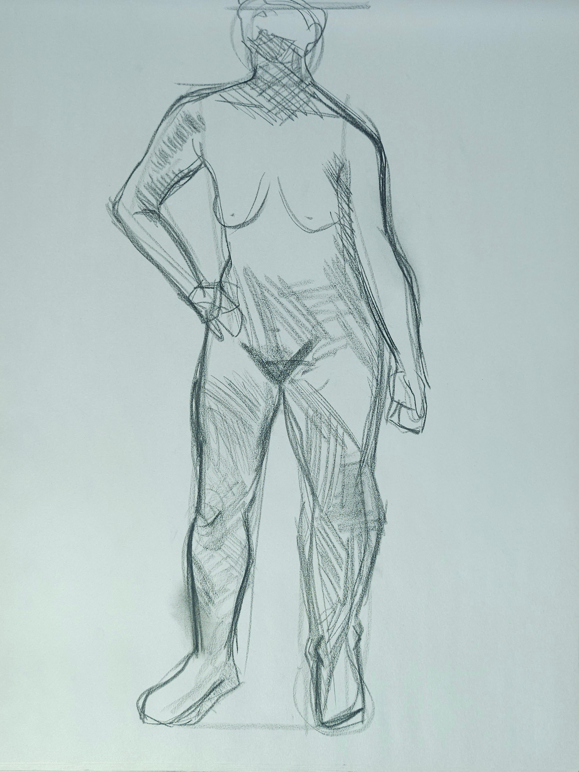
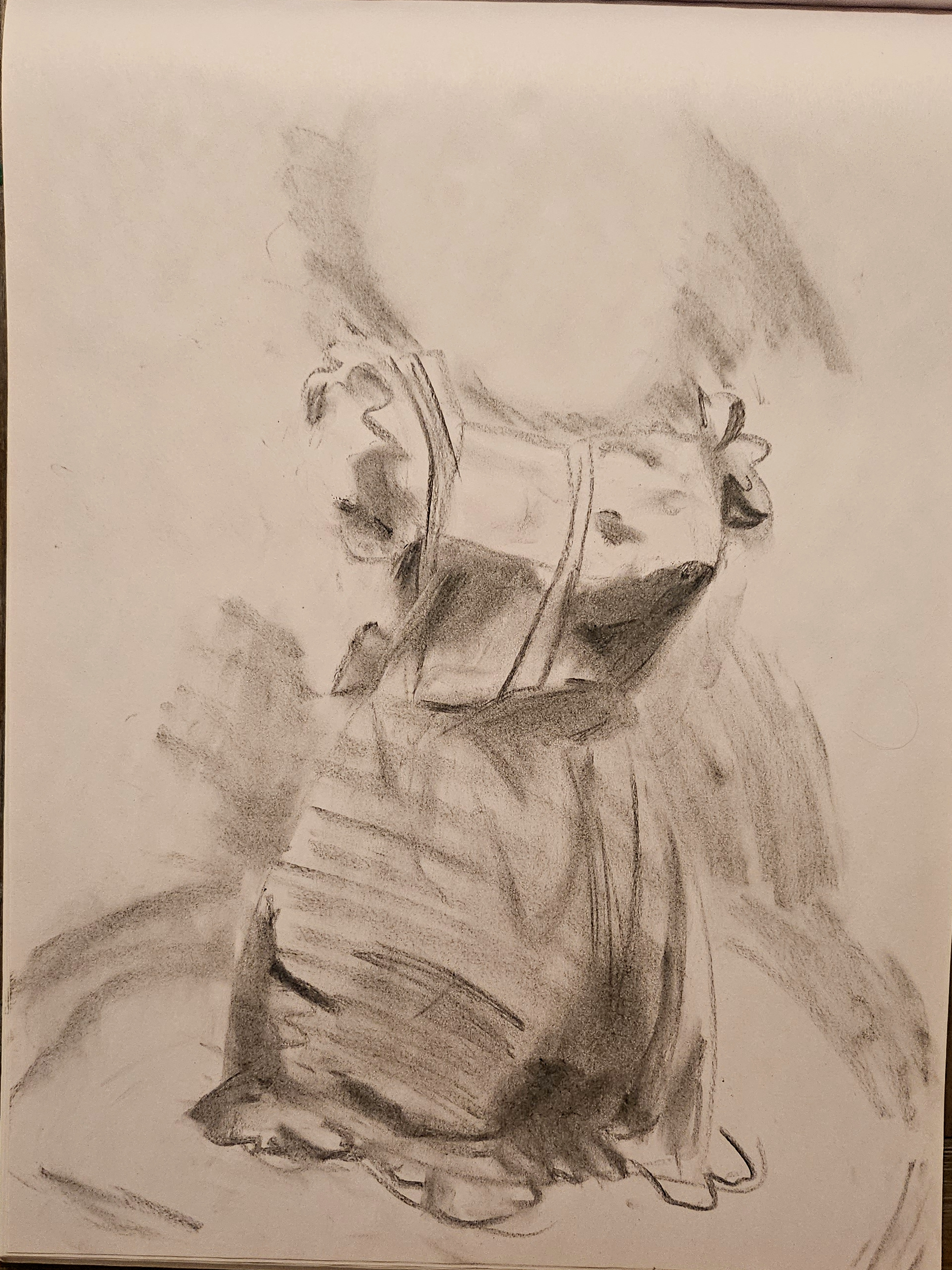
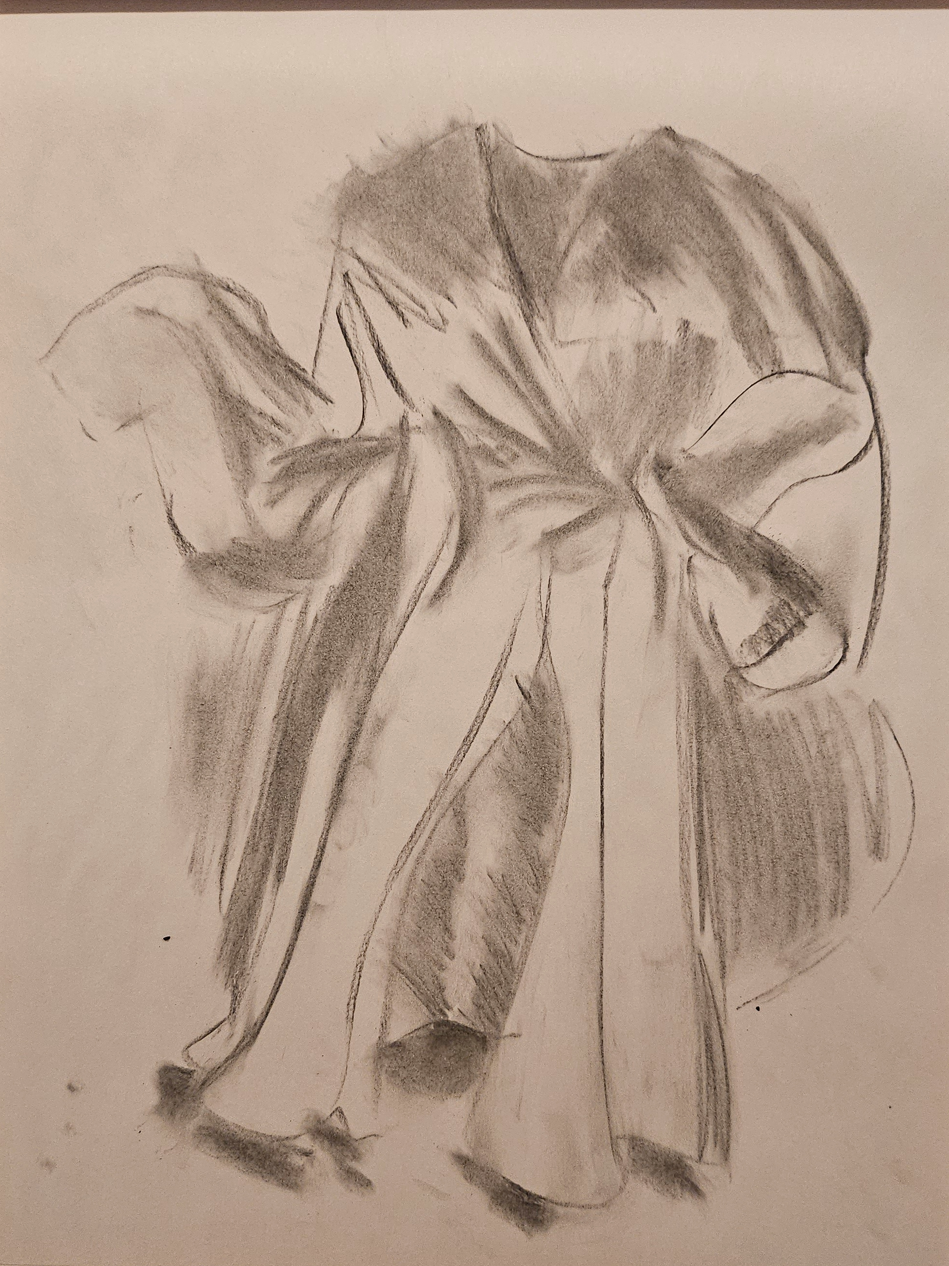
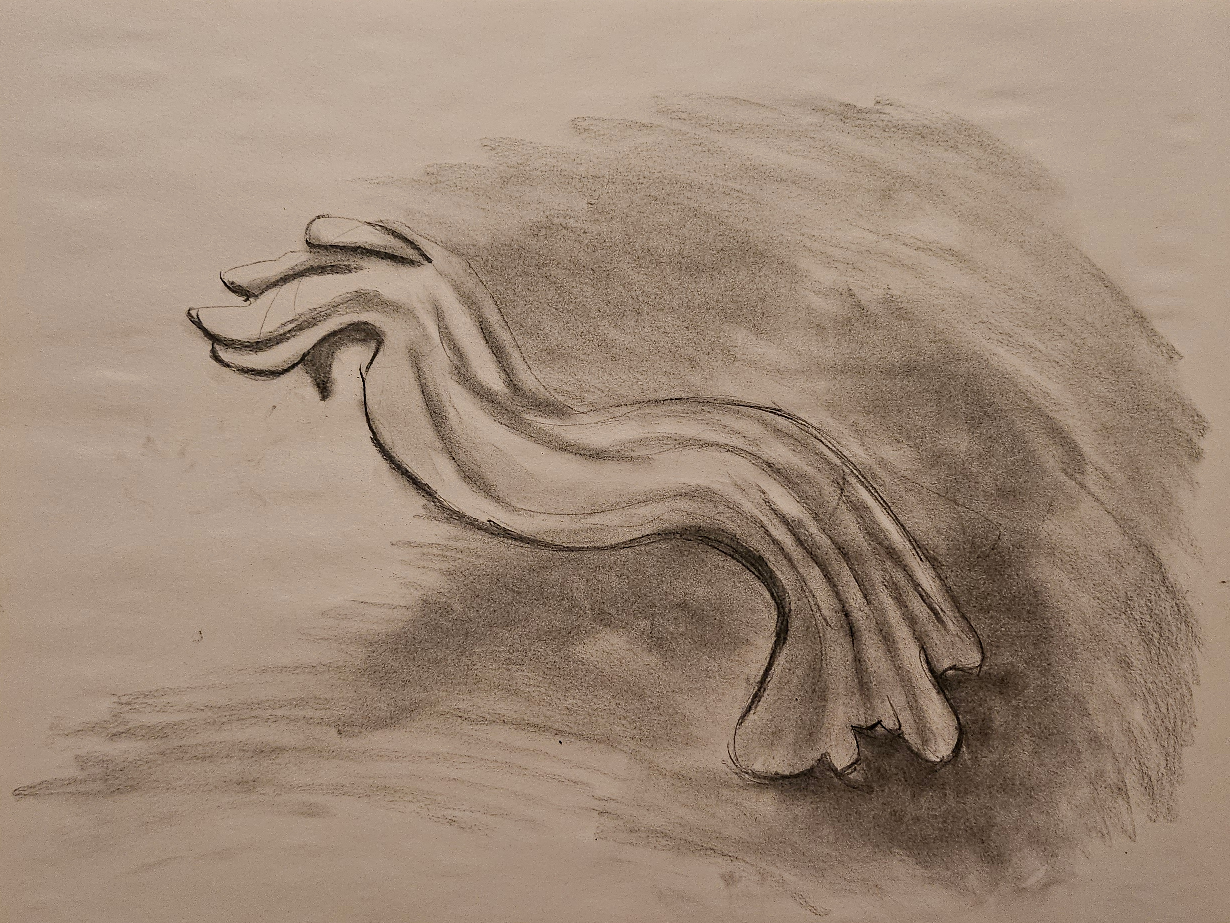
Life Drawing
Gesture Drawing
For a class called life drawing, the lessons are more focused on the fundamentals of measuring and working with charcoal, than it is on learning the human form.
.jpg)
.jpg)
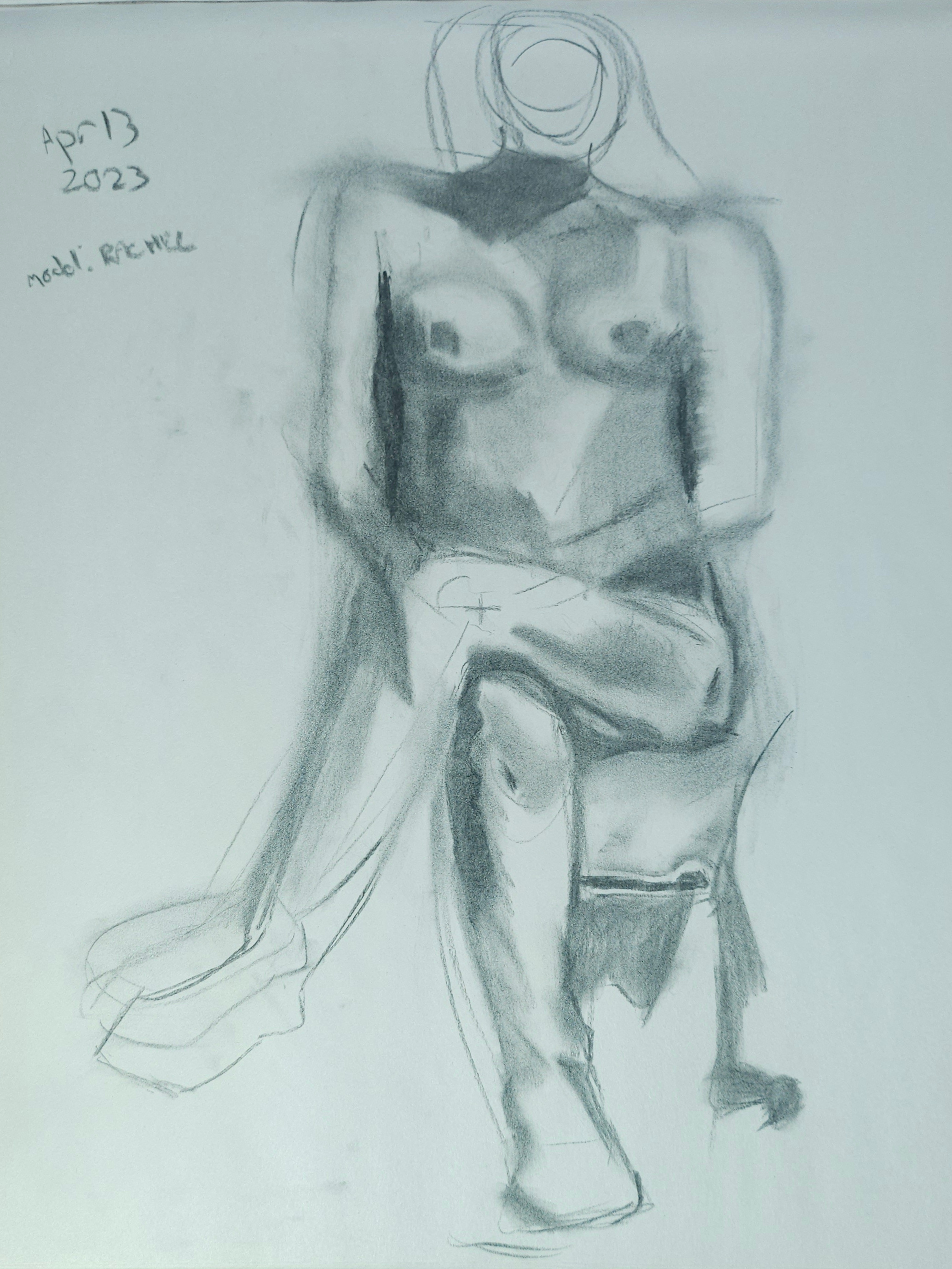
Tonal Drawing
The models this semester were Janelle, Rachel, and Olessya.
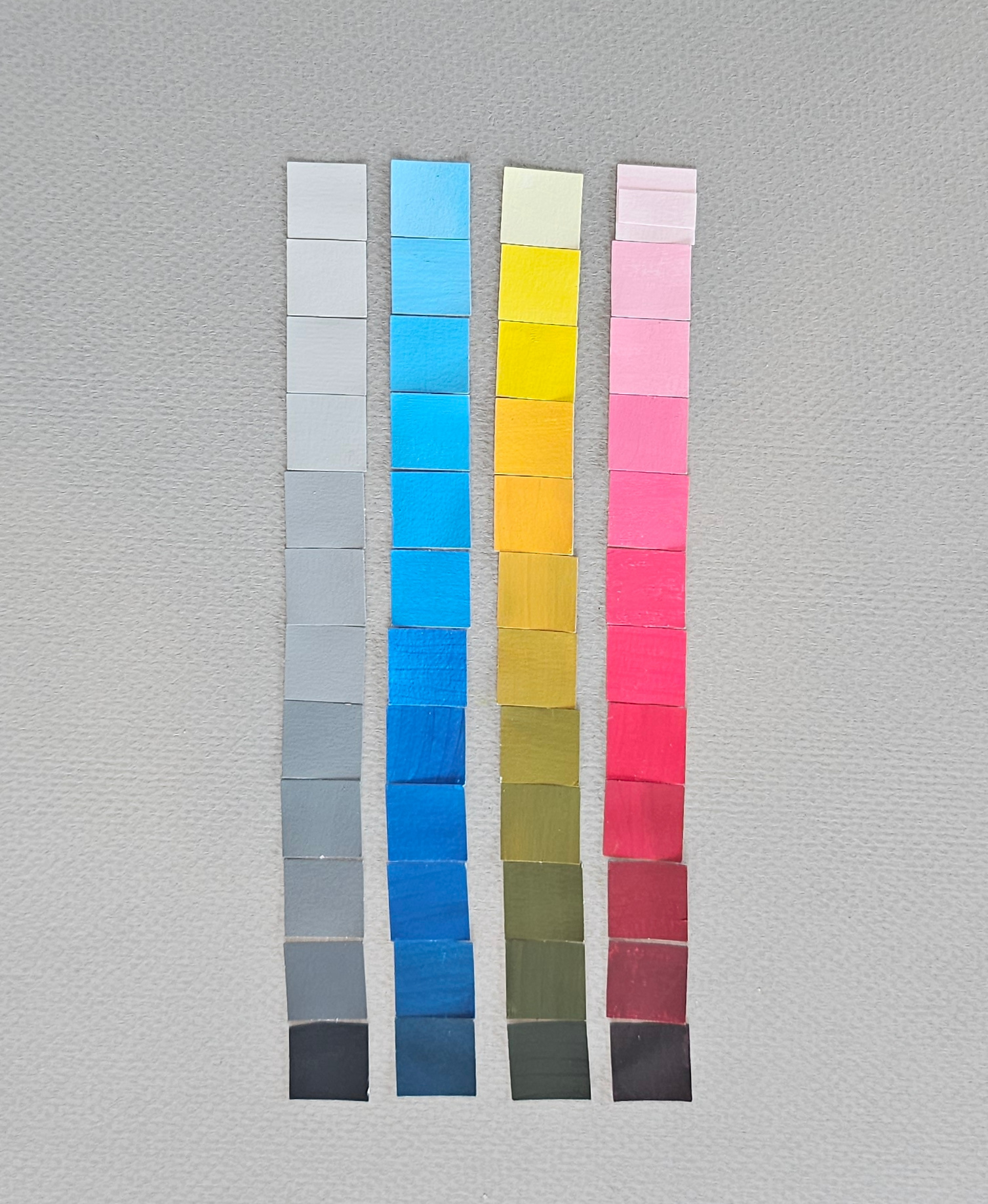
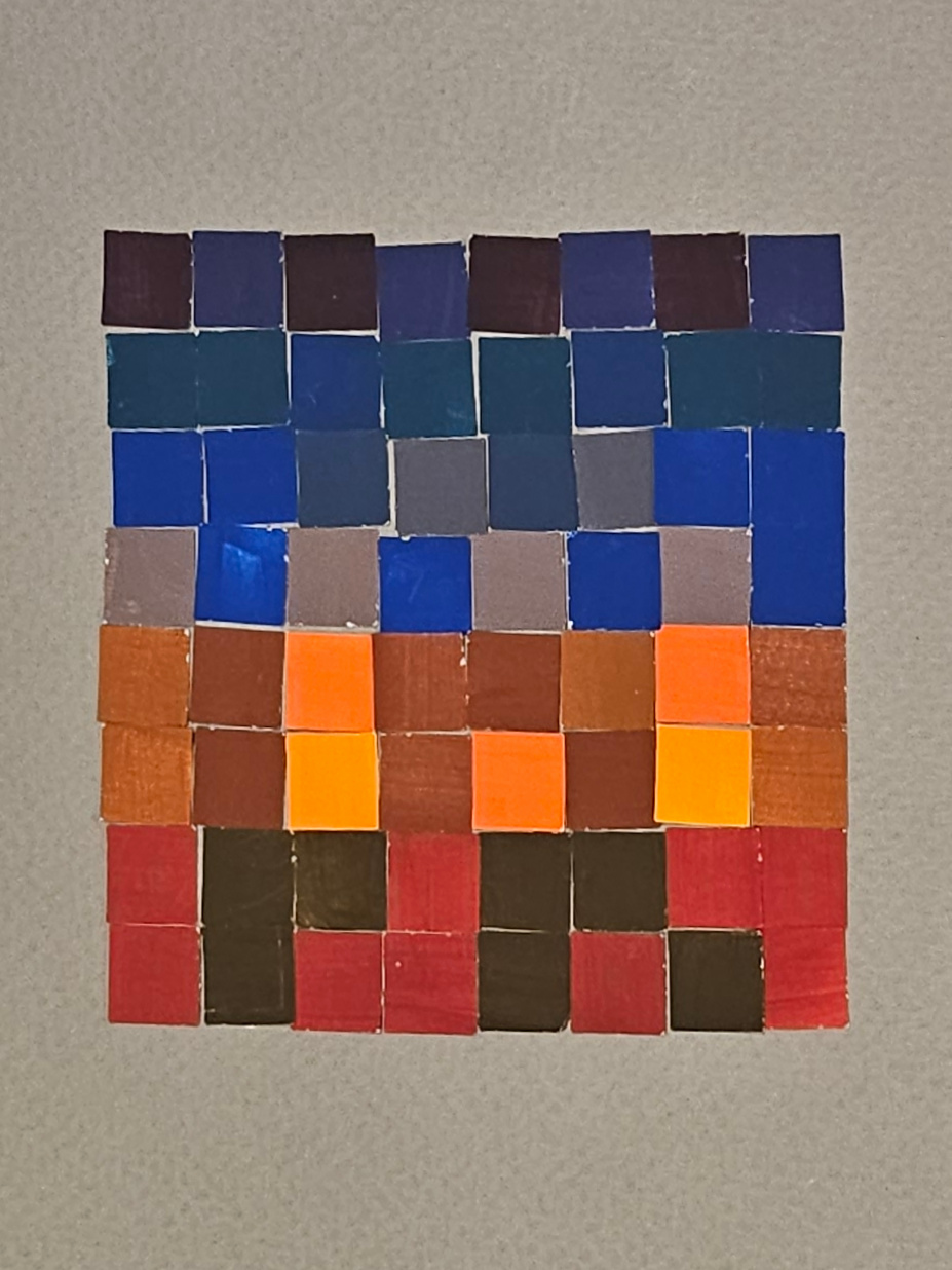
Color Theory
Color Wheel
This class was entirely focused on producing and arranging color swatches. Certainly a useful skill to have, identifying colors is important in any medium. But for a graphic design major, I was not comfortable in the medium of paint, and struggled a lot.
.jpg)
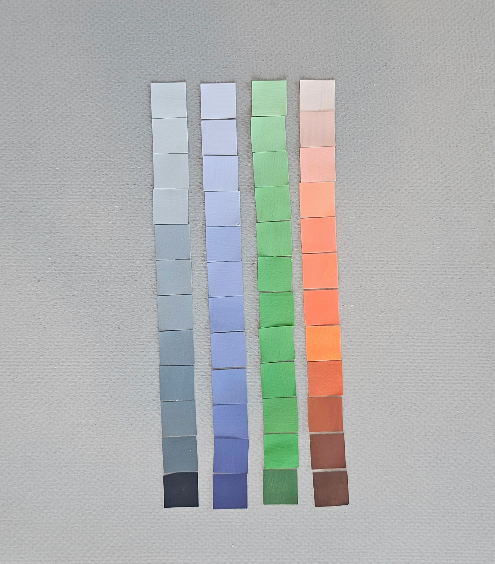
Value Scales
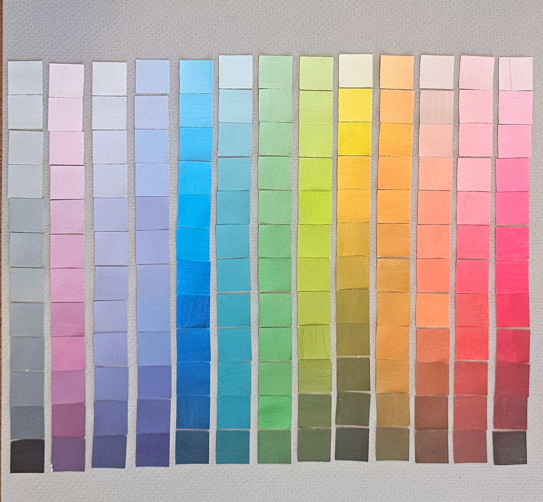
Exploring the light and dark values of the three primary, and three tertiary colors. The final picture included has scales for 12 hues of the color wheel, along with grey.
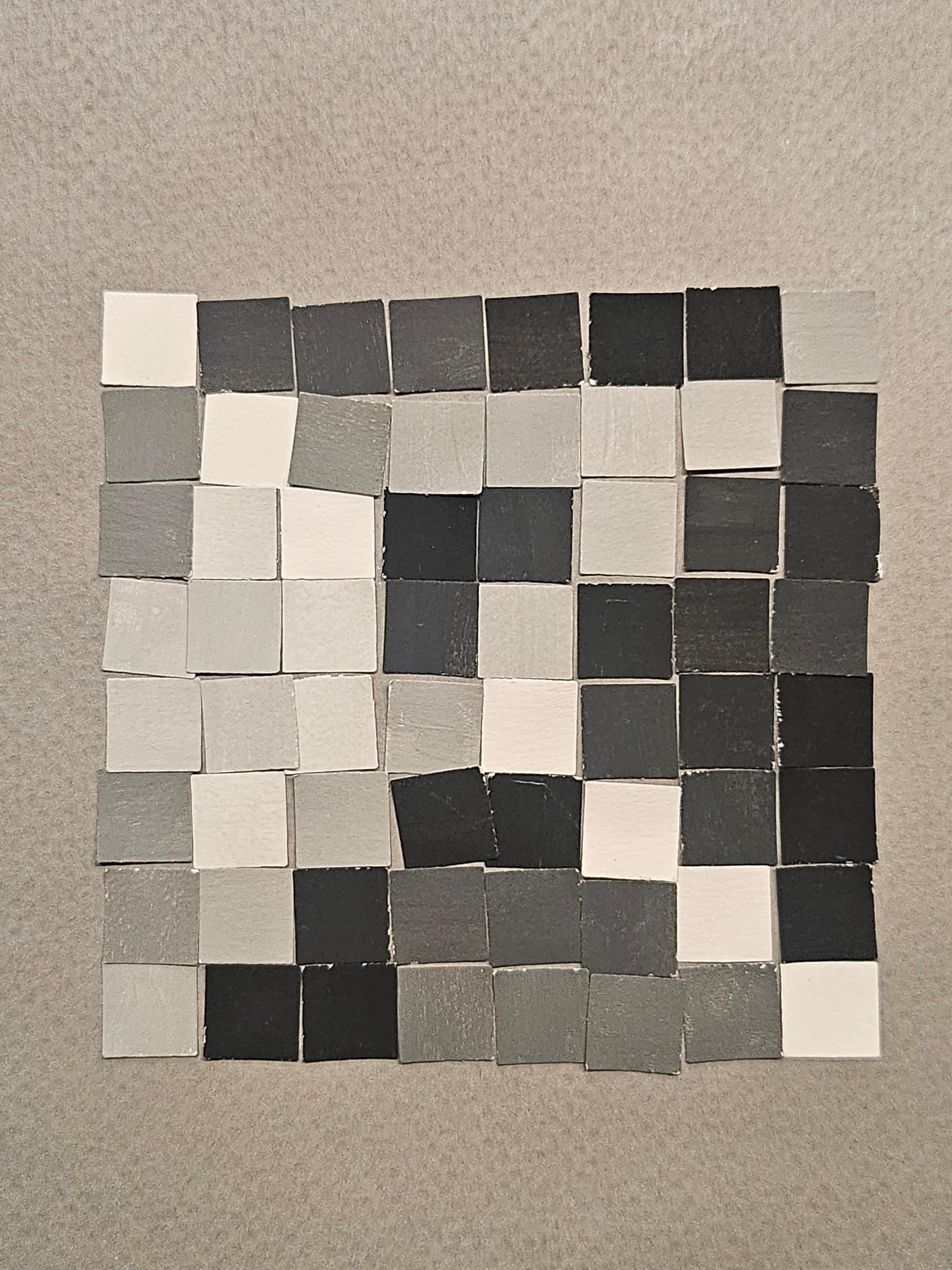
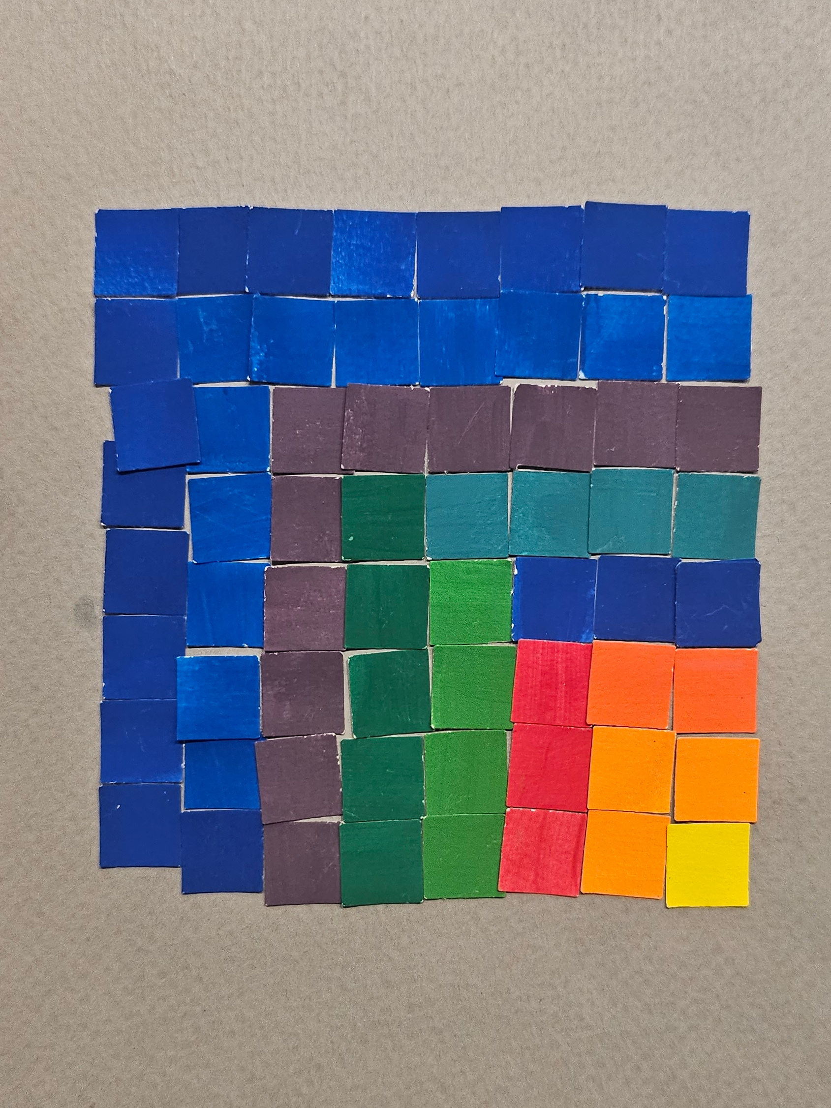
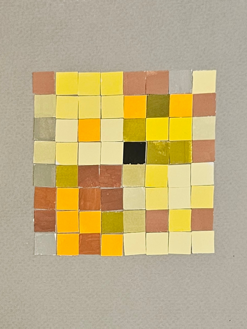
Harmony & Contrast
These compositions of color swatches aim to either unite two opposing hues, or to create a sharp contrast between them.
.jpg)
.jpg)
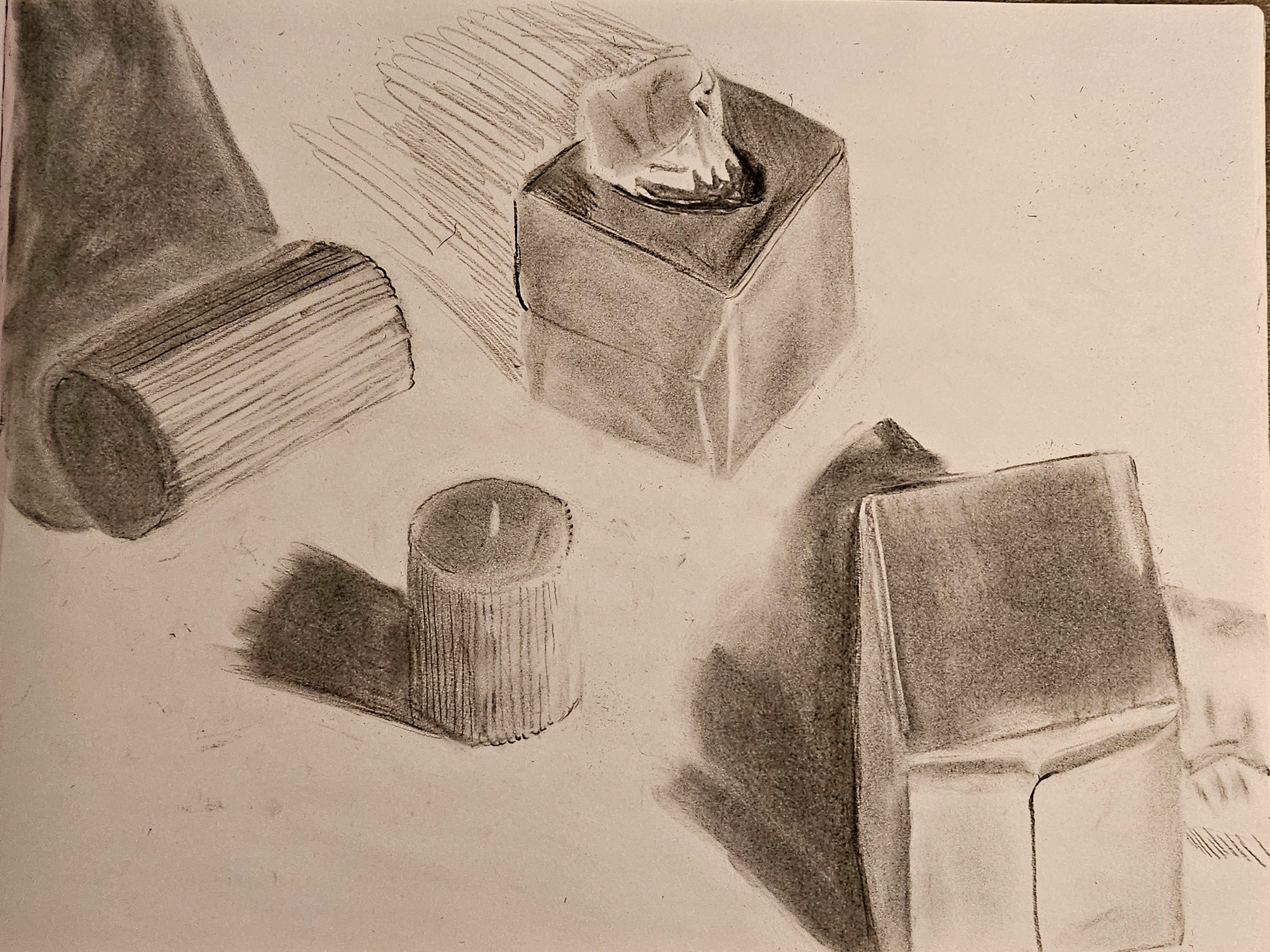
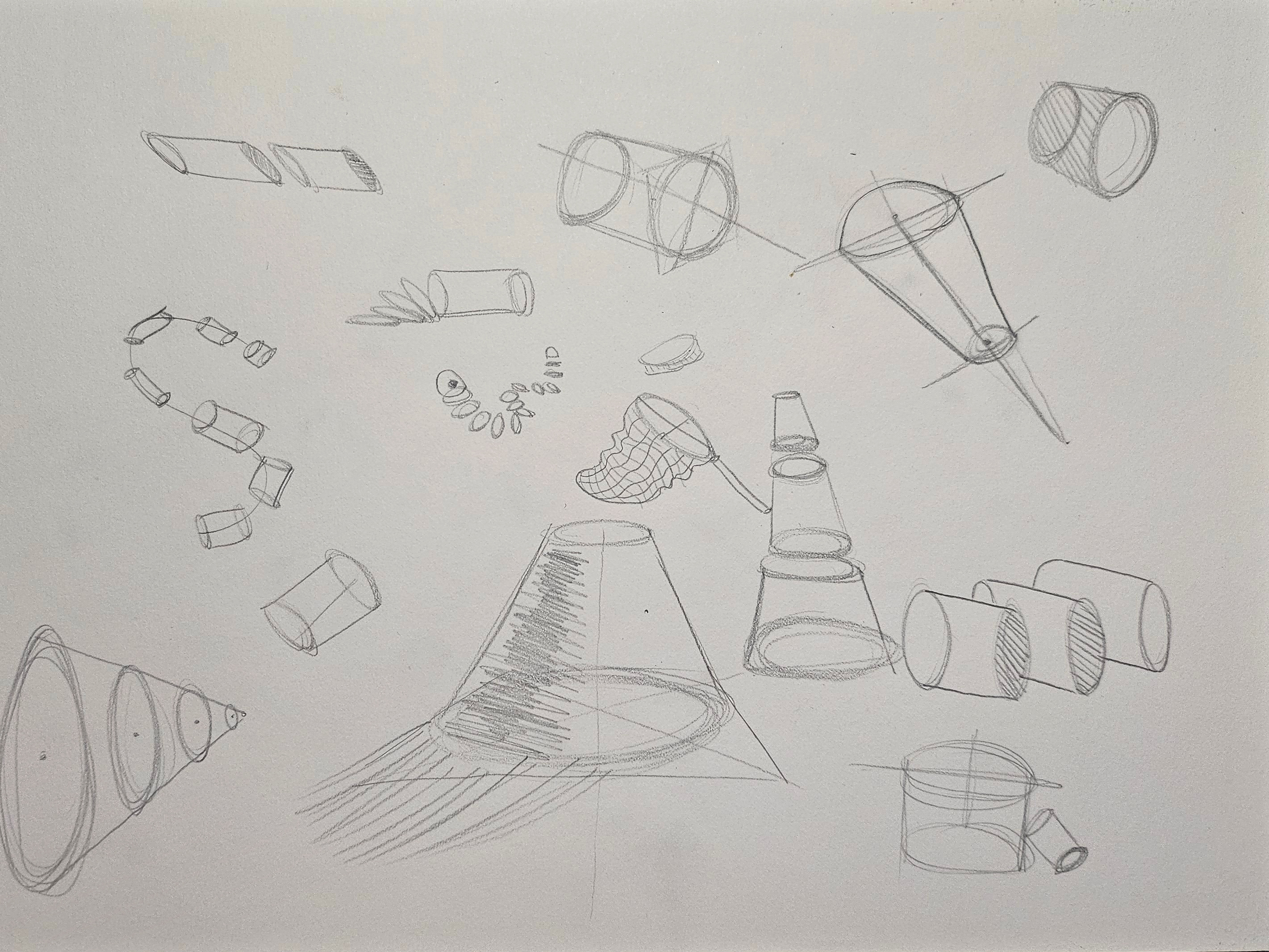
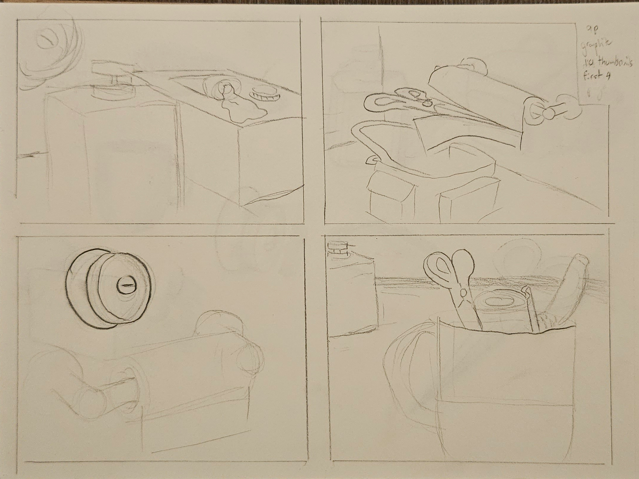
Concept Sketching
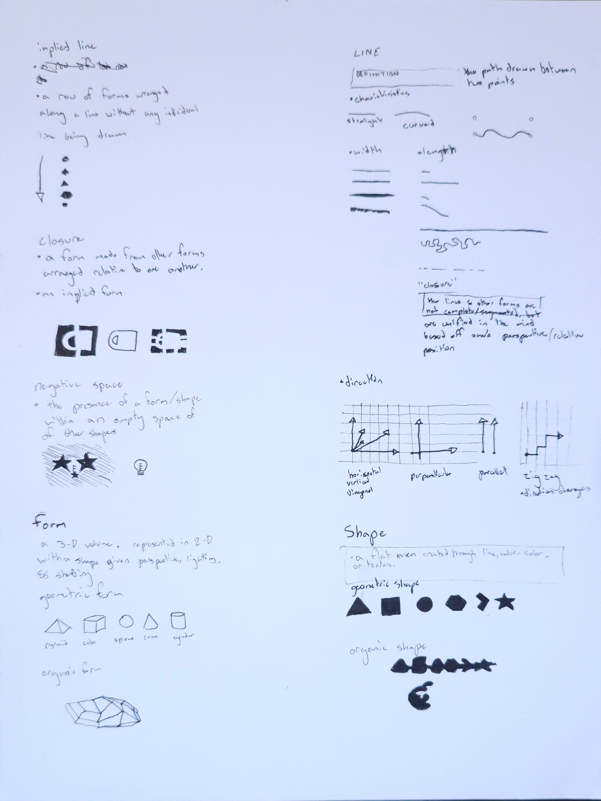
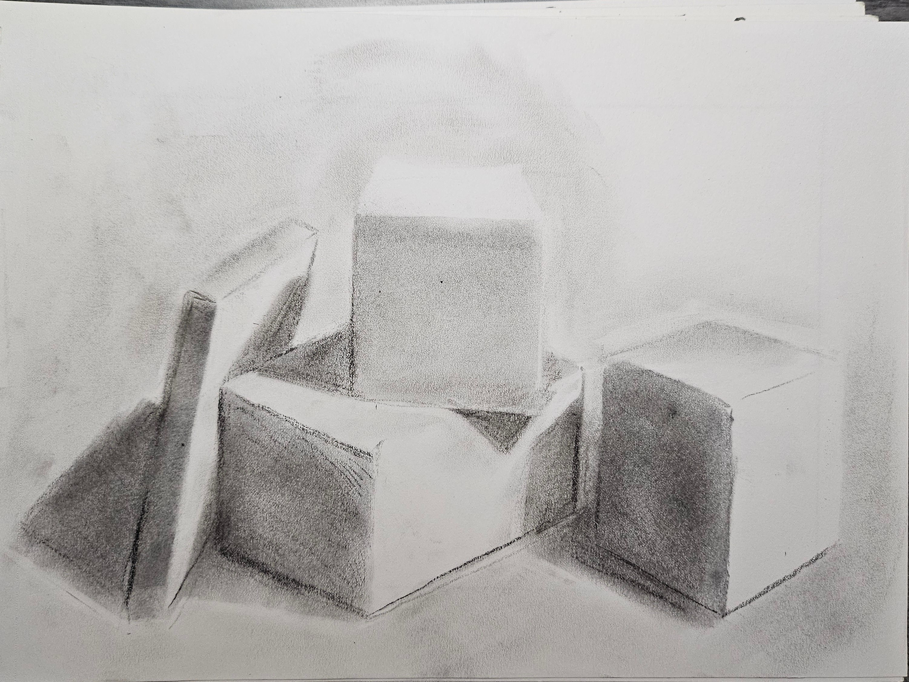
Shapes and Value
More fundamentals with a focus on still lifes. These were made over a year after the still lifes at the top of this page, and my ability to draw straight to value as opposed to relying on line has greatly improved since.
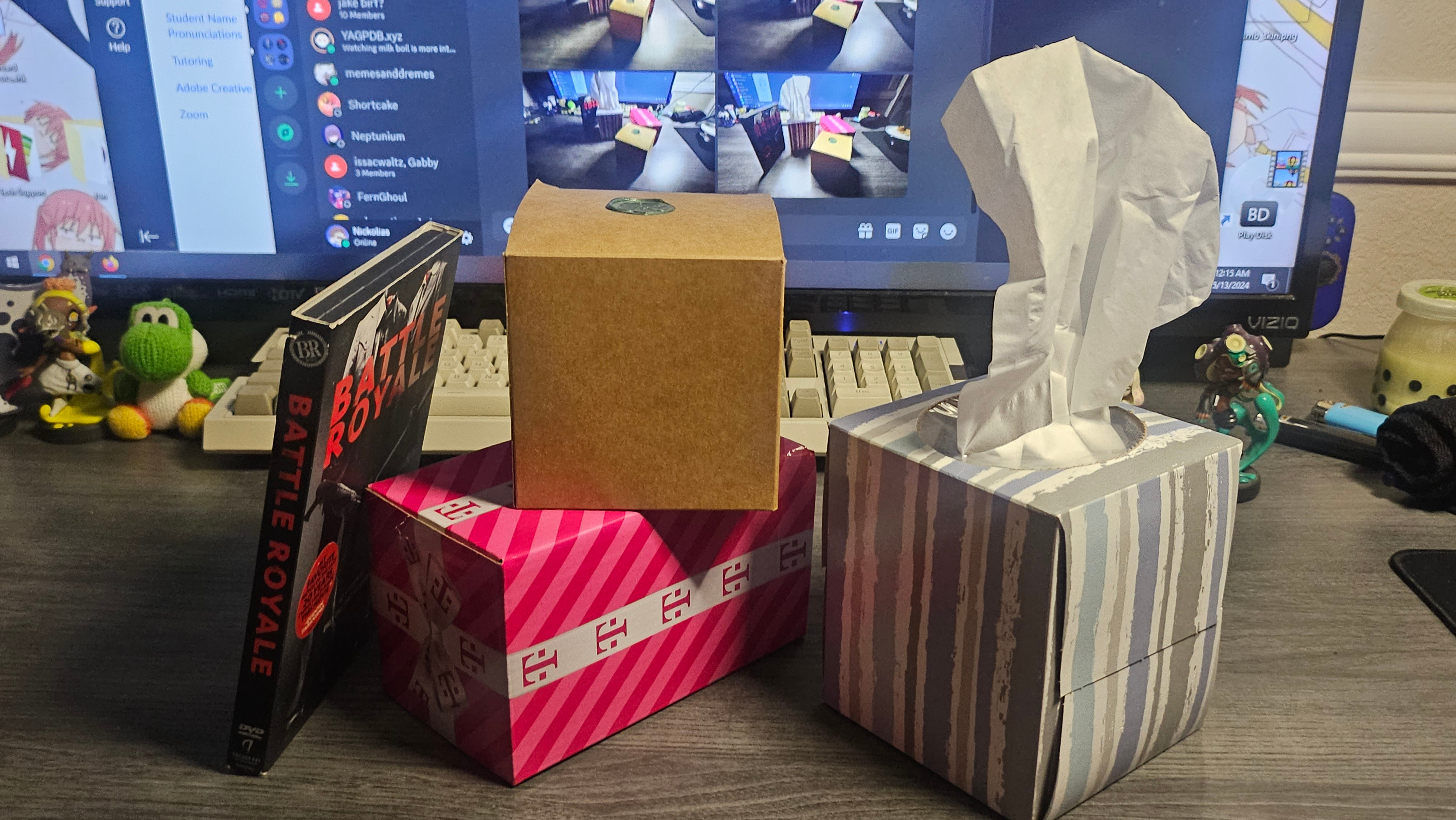
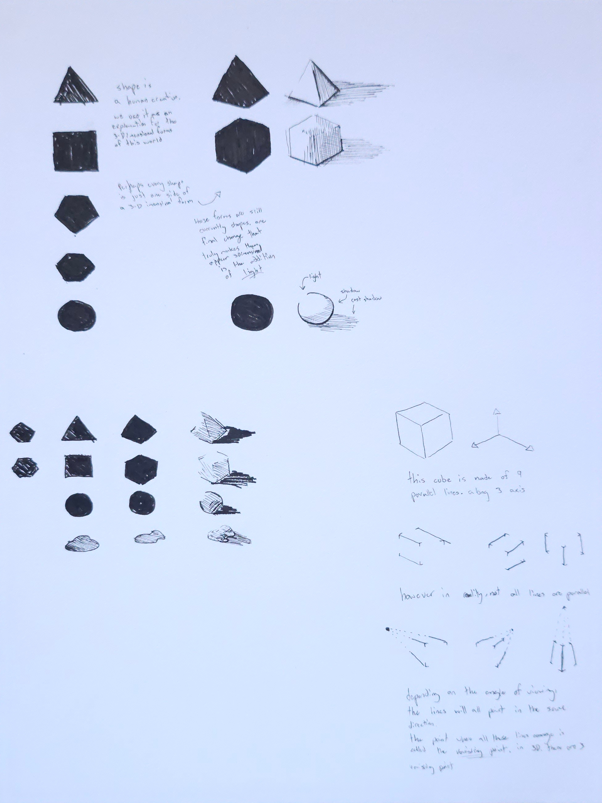
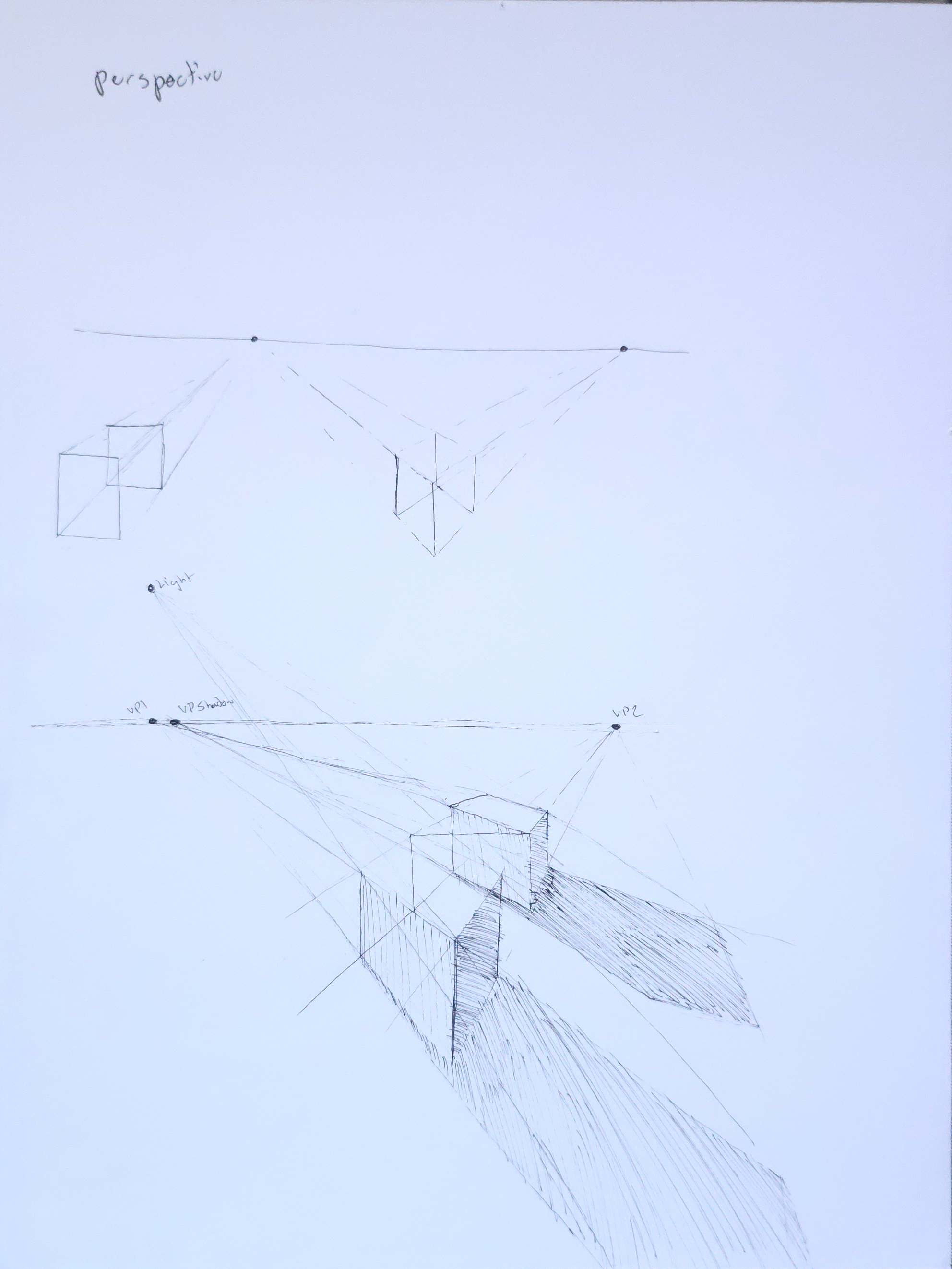
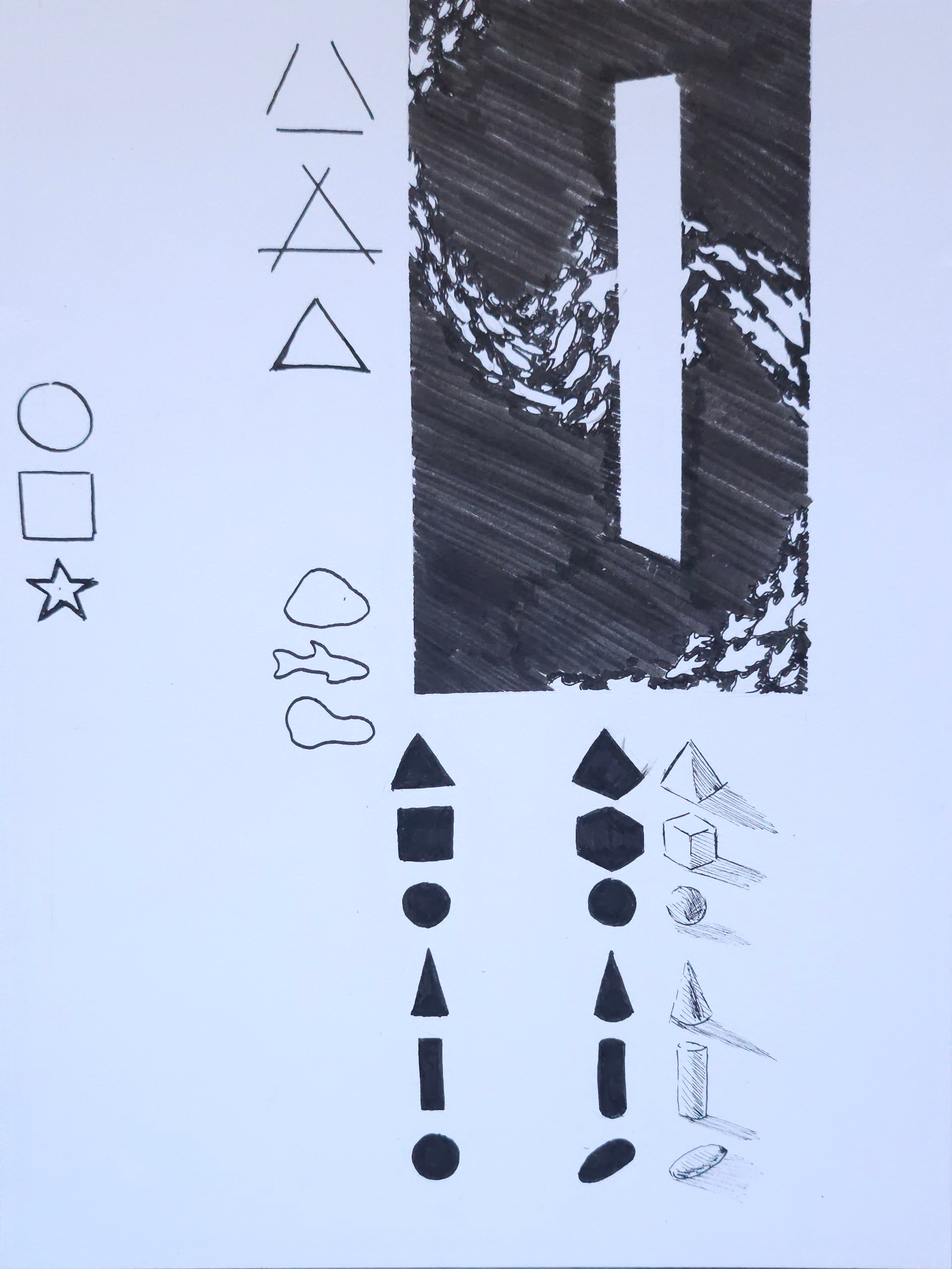
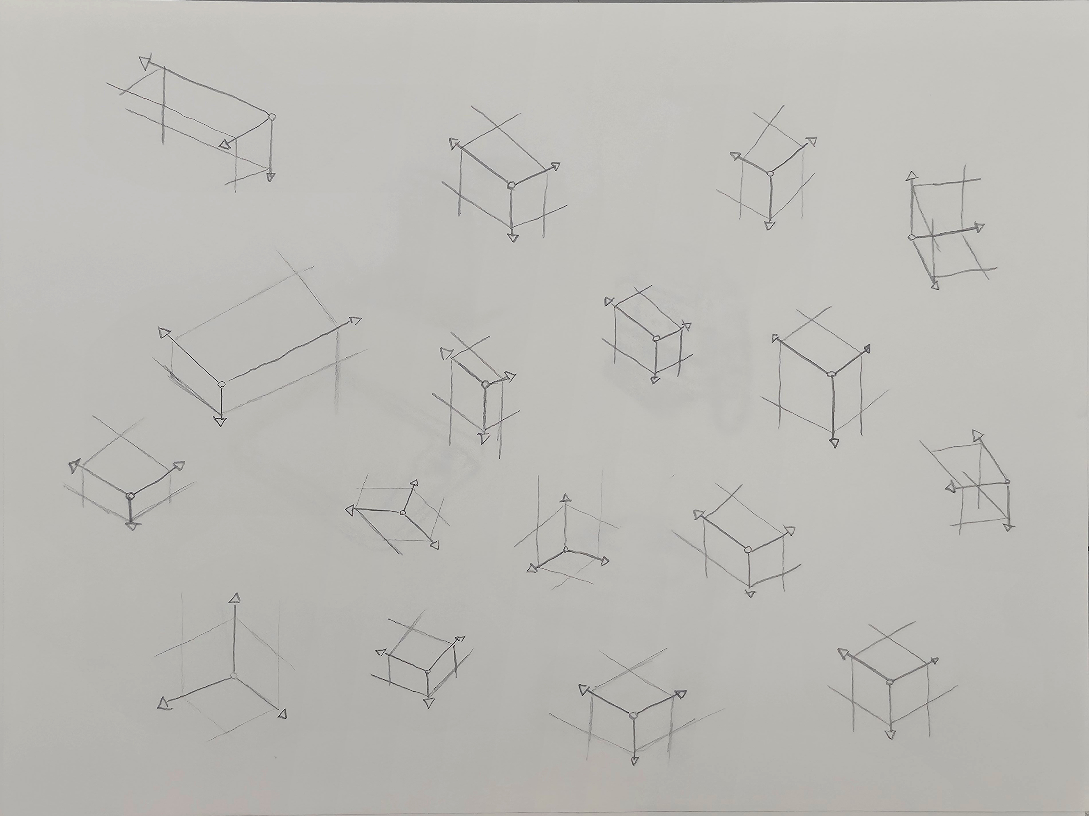
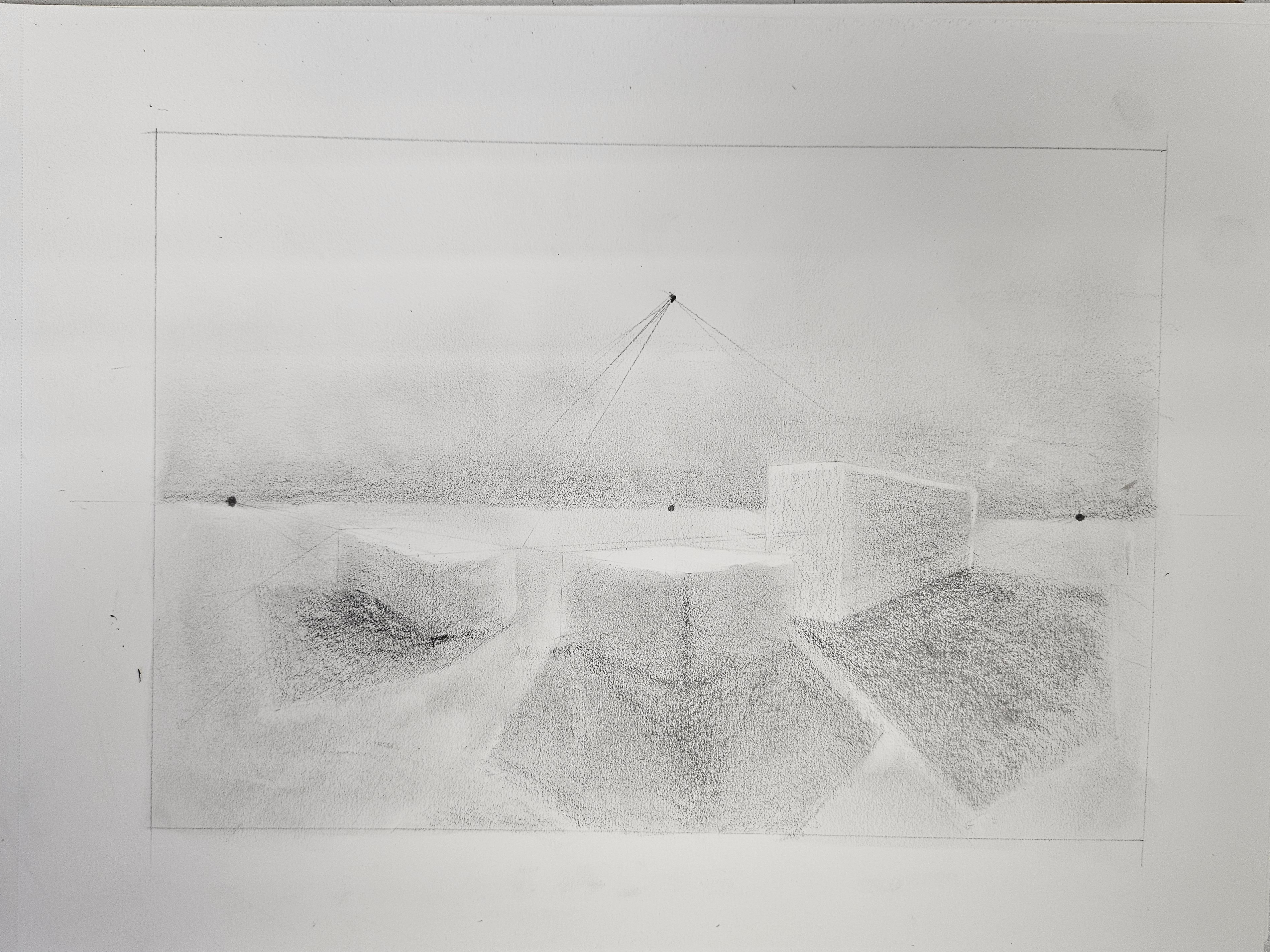
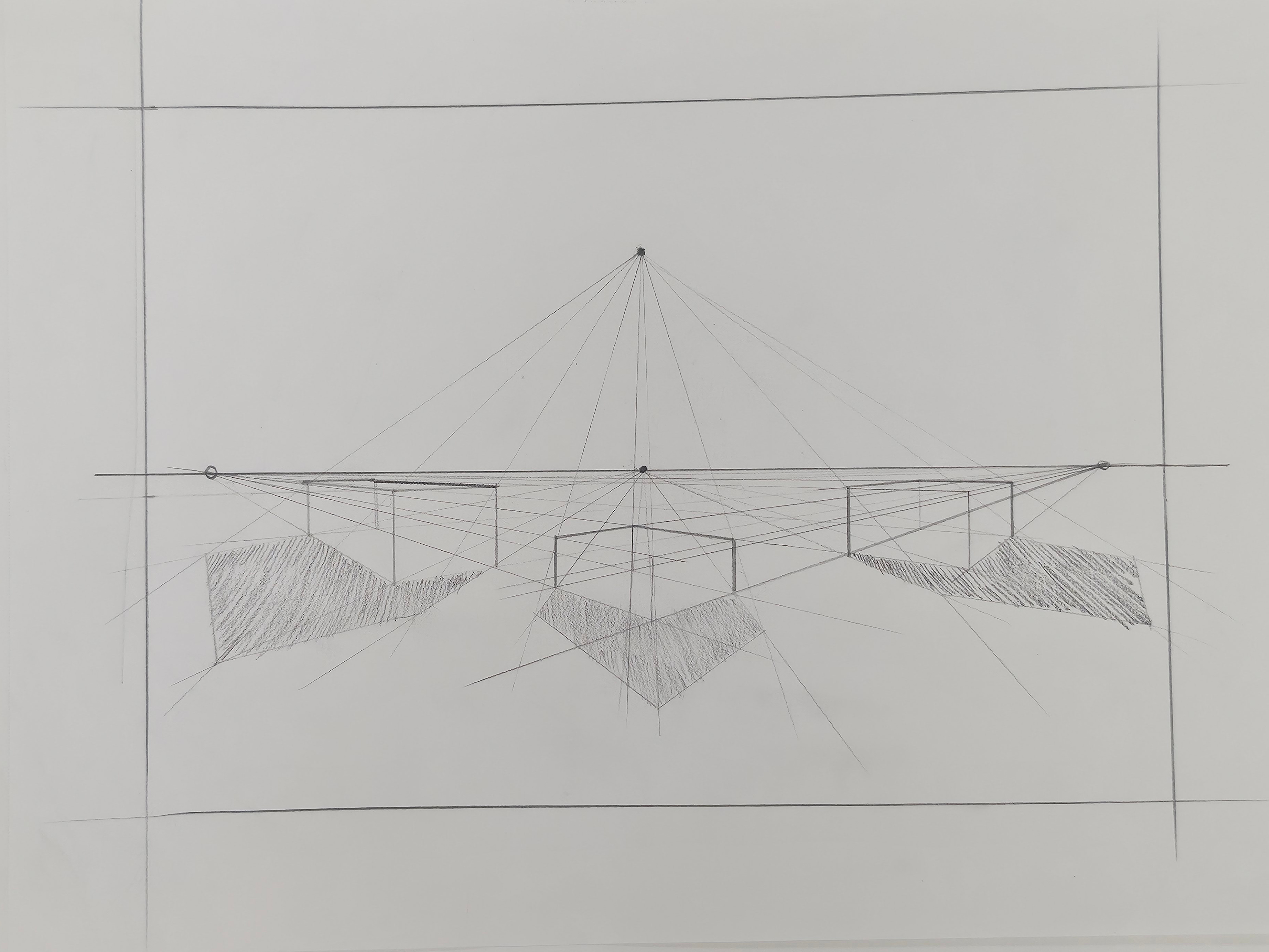
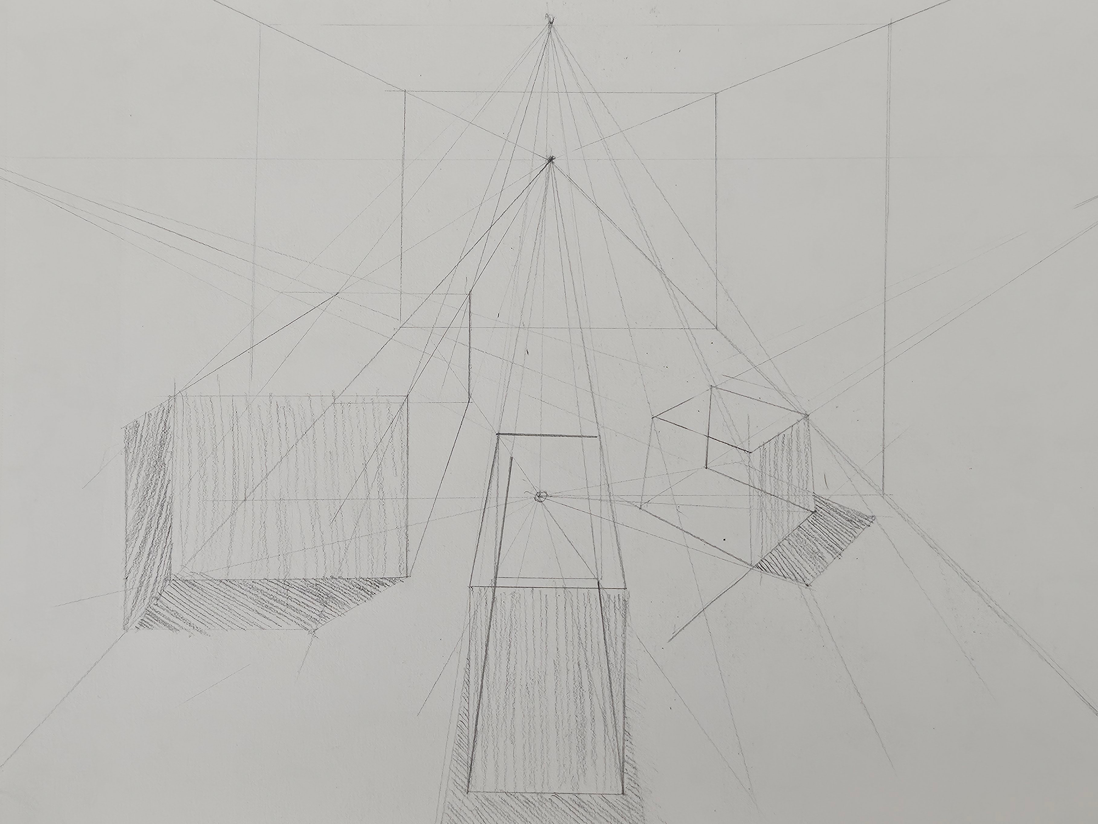
Perspective & Composition
The second quarter of the class was spent focusing on geometric shapes and how to best arrange them. Learning to imagine everyday objects as a colection of geometric shapes is very useful, as digital design typically involves drawing out designs circles and squares.
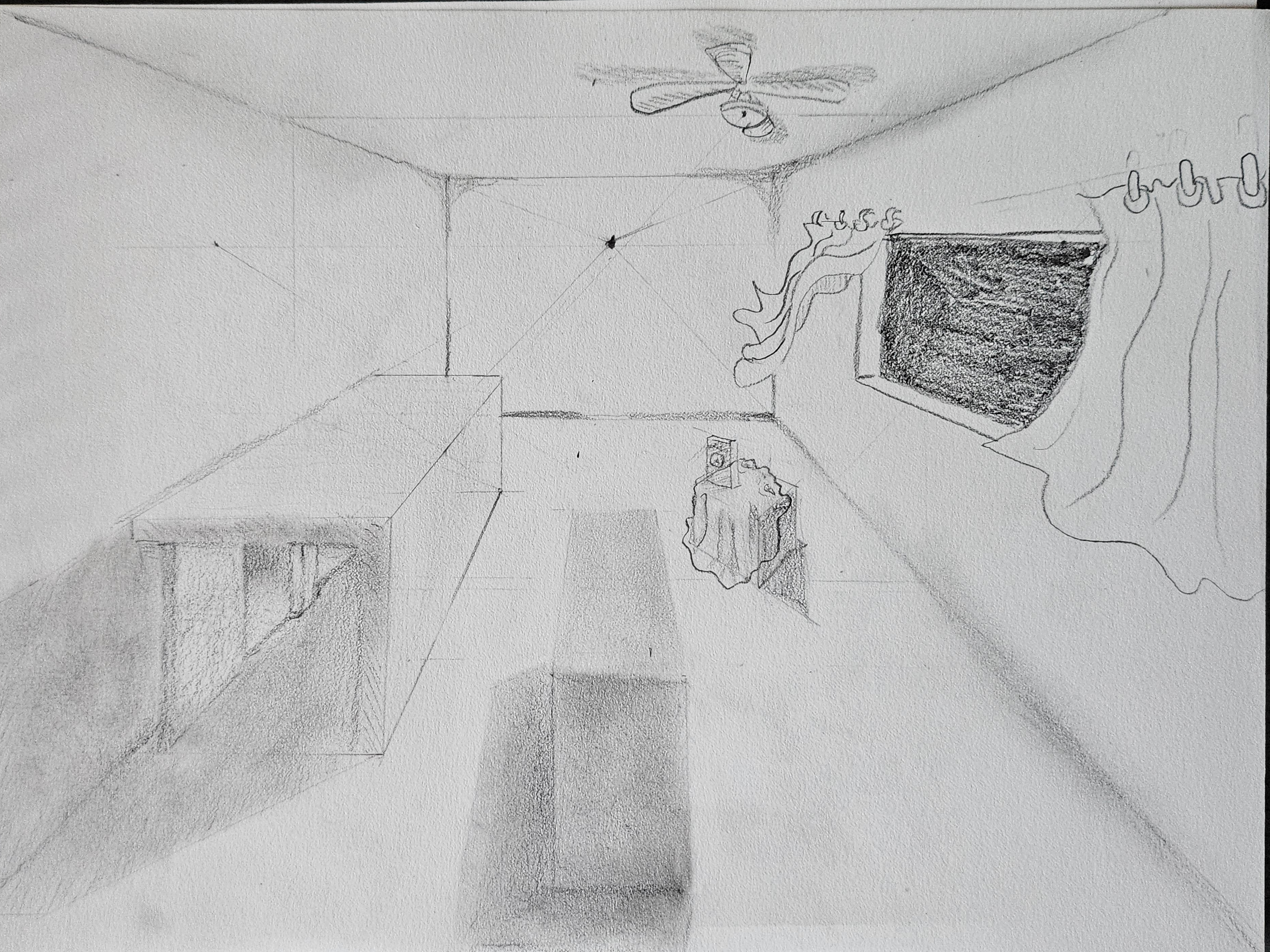
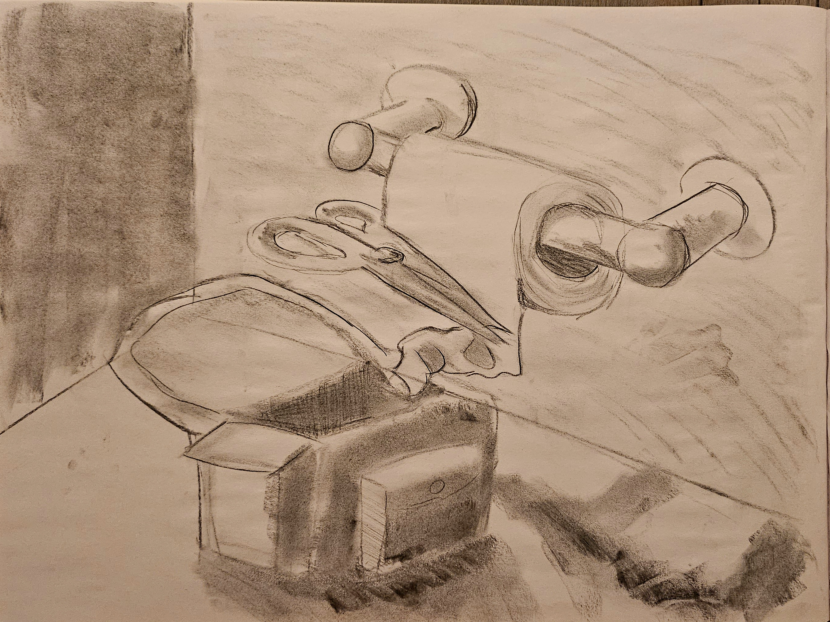
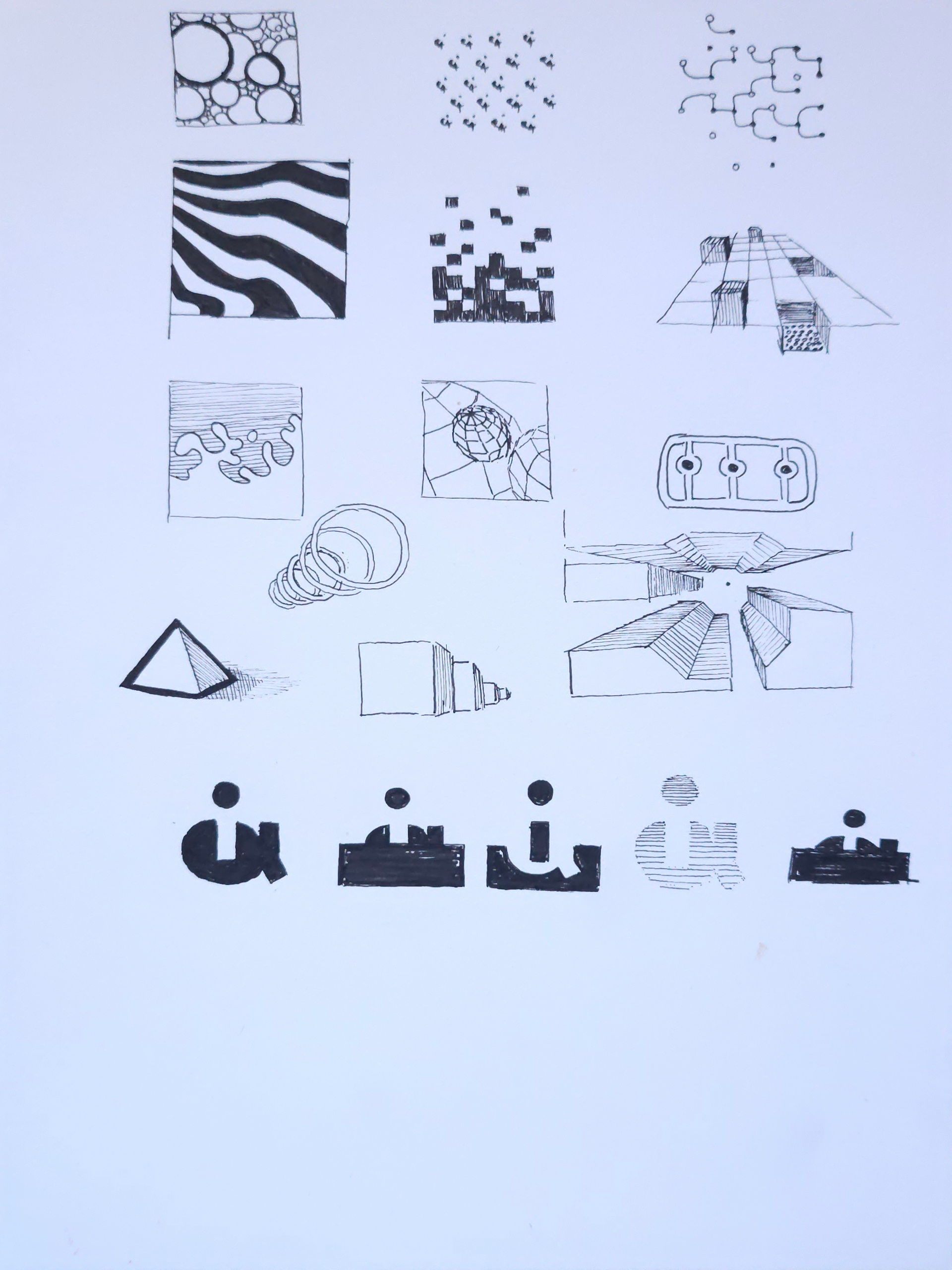
Texture
I was able to carry over some skills from my life drawing class to this section, which came in handy when blending and shading using charcoal.
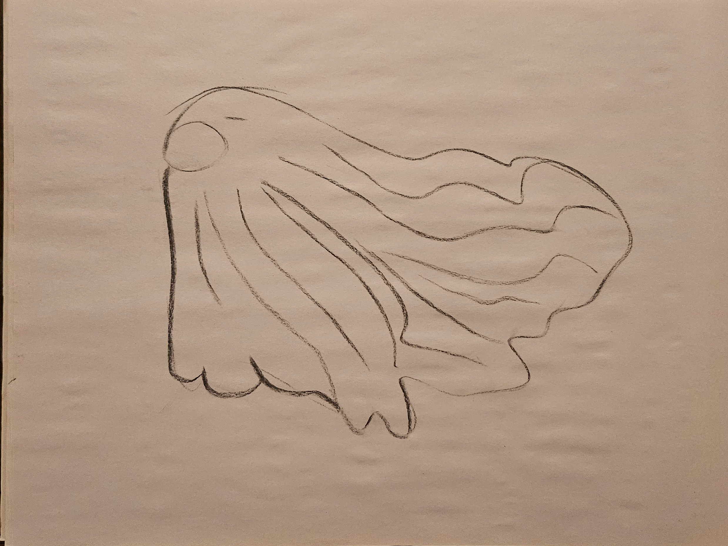
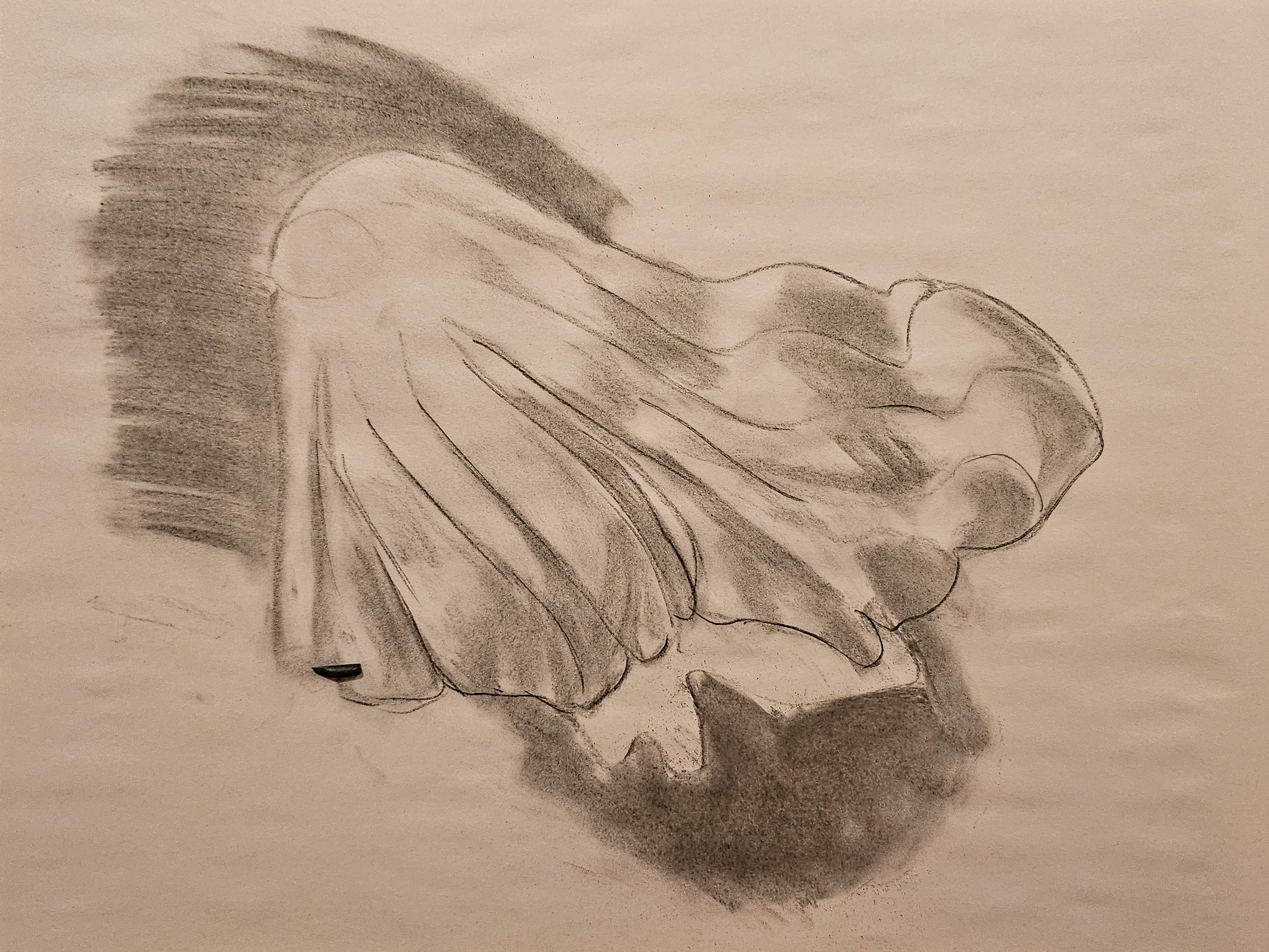
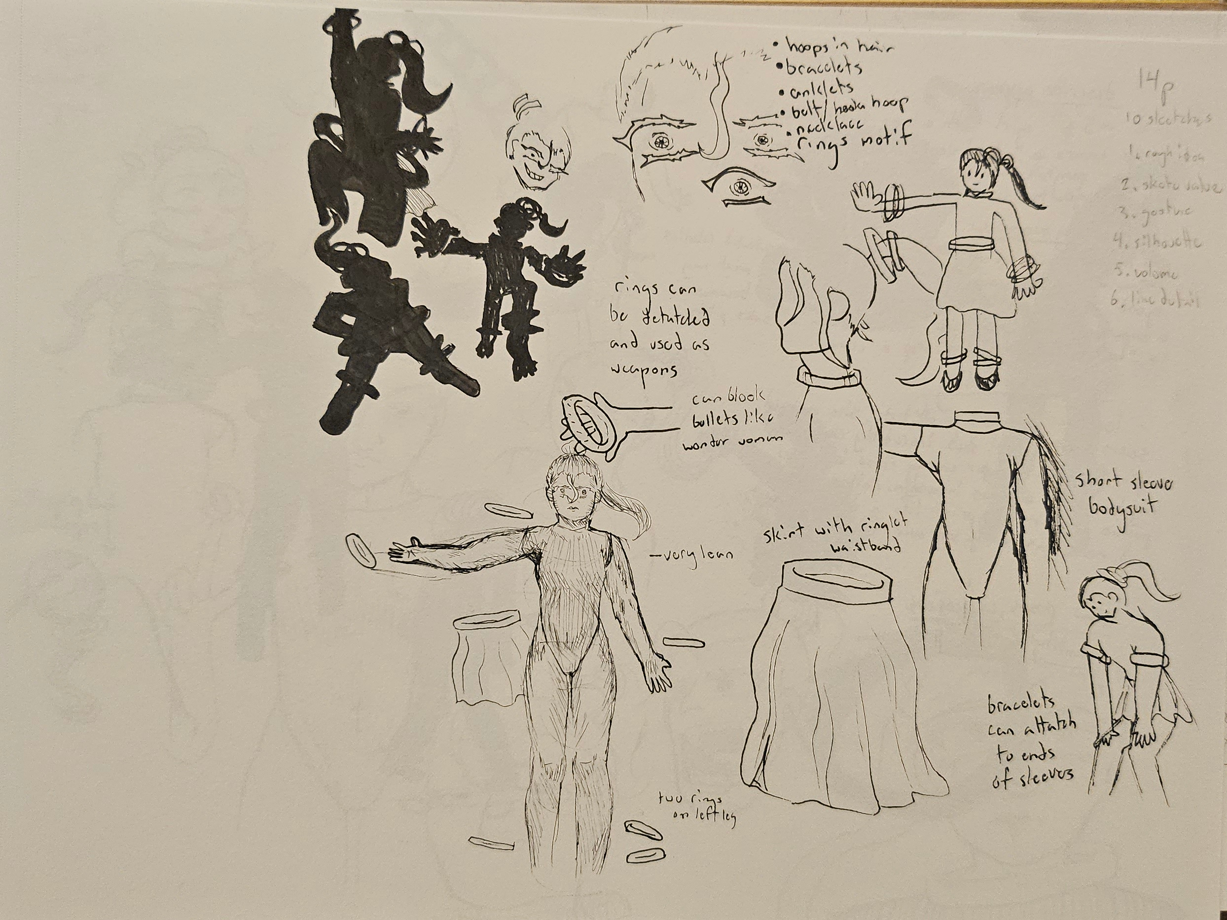
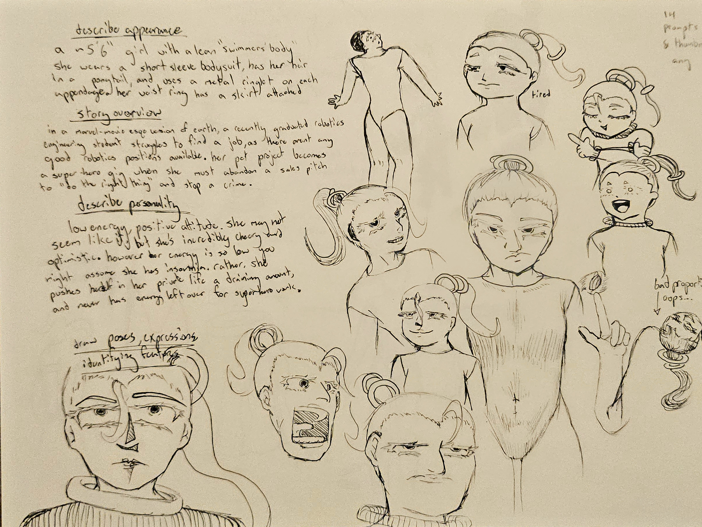
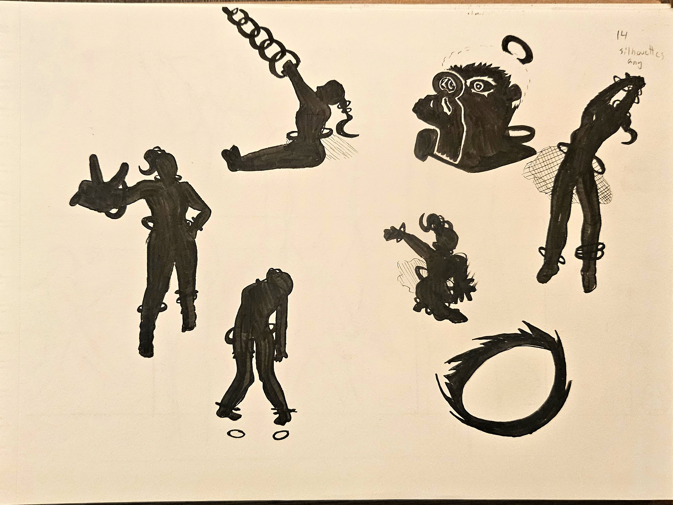
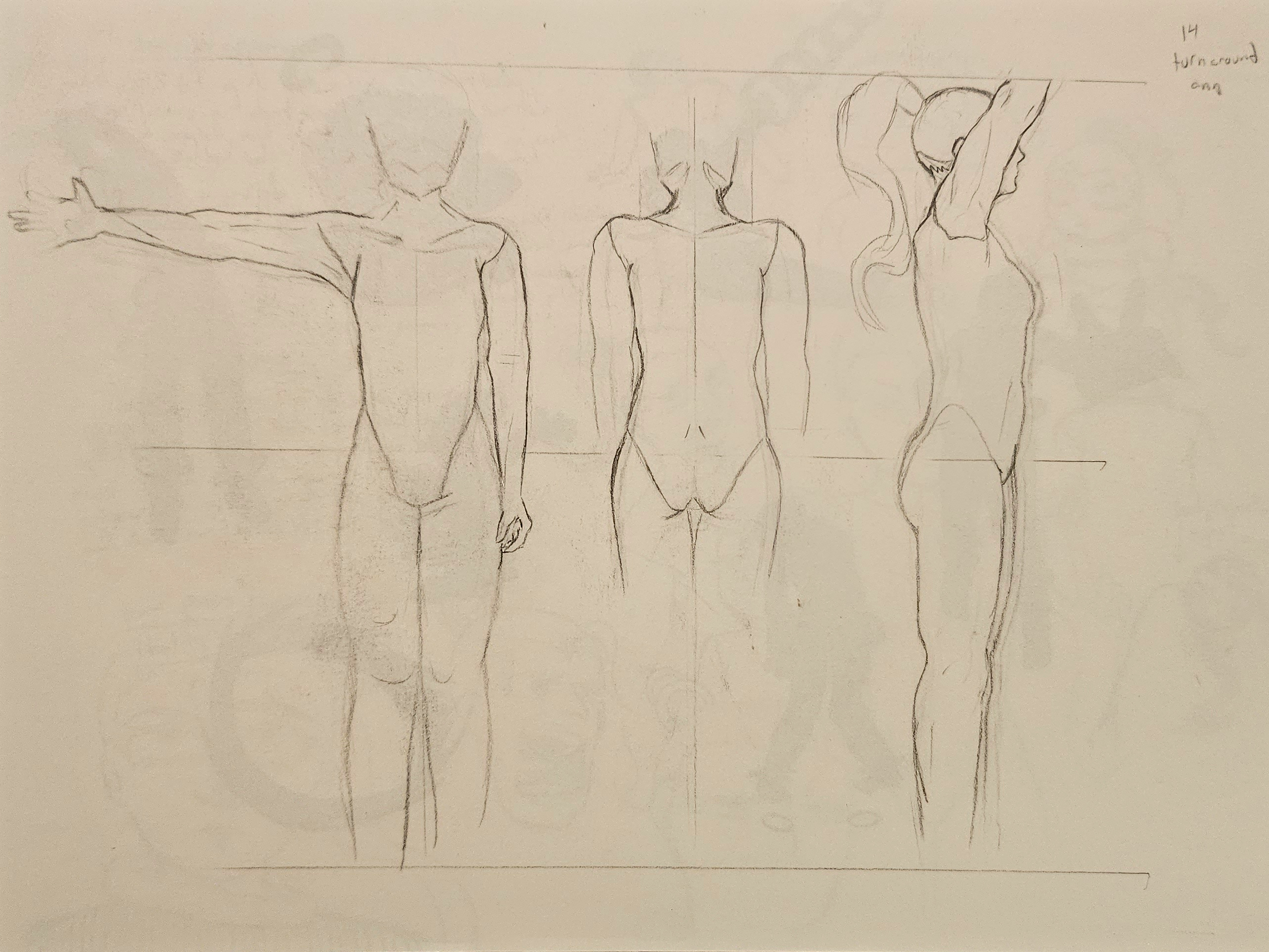
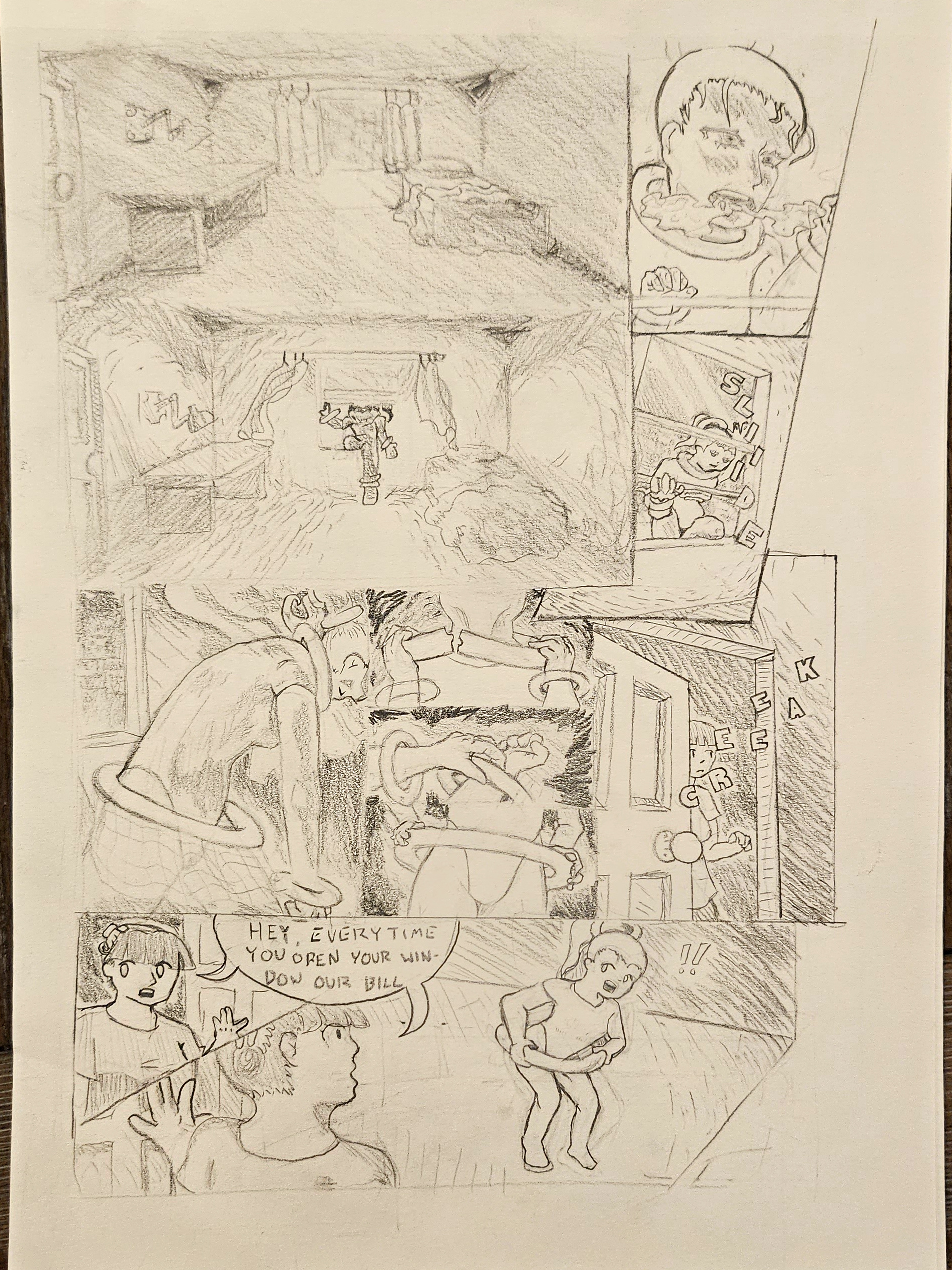
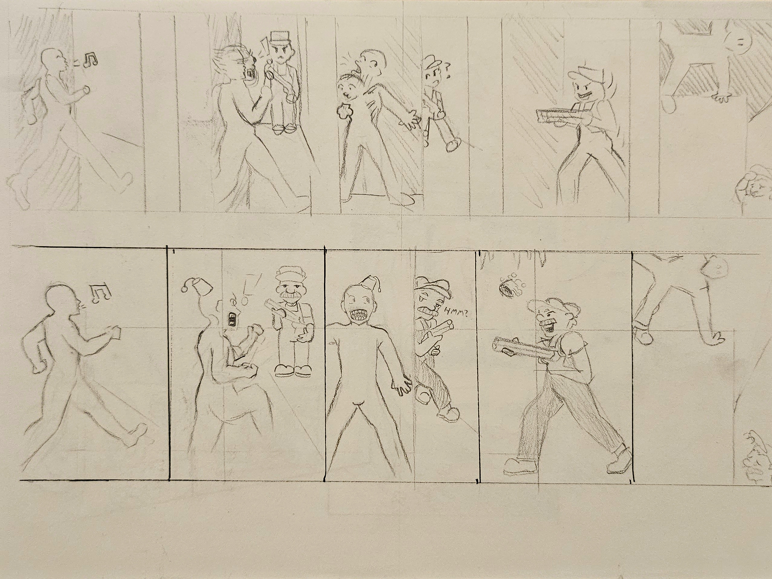
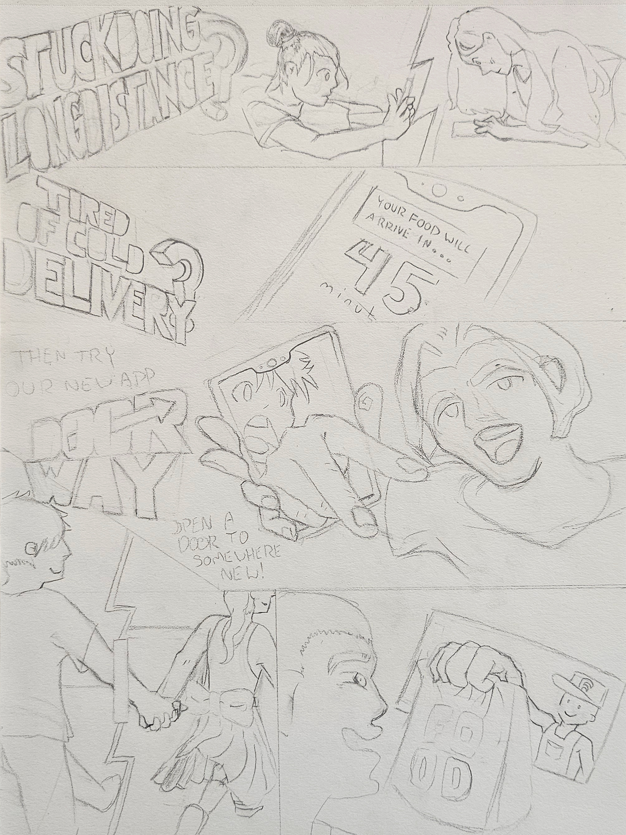
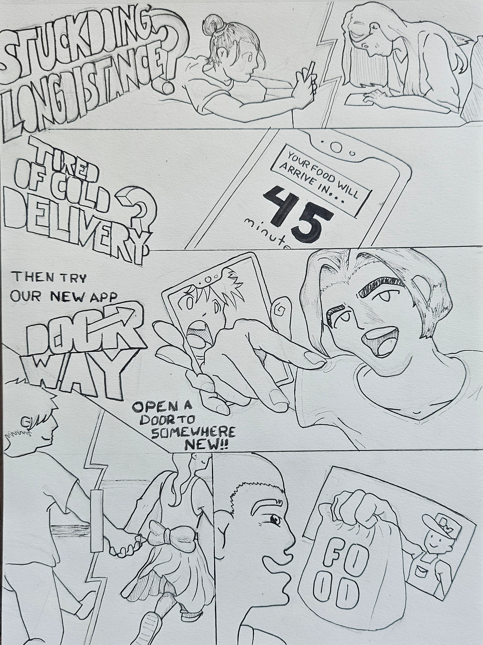
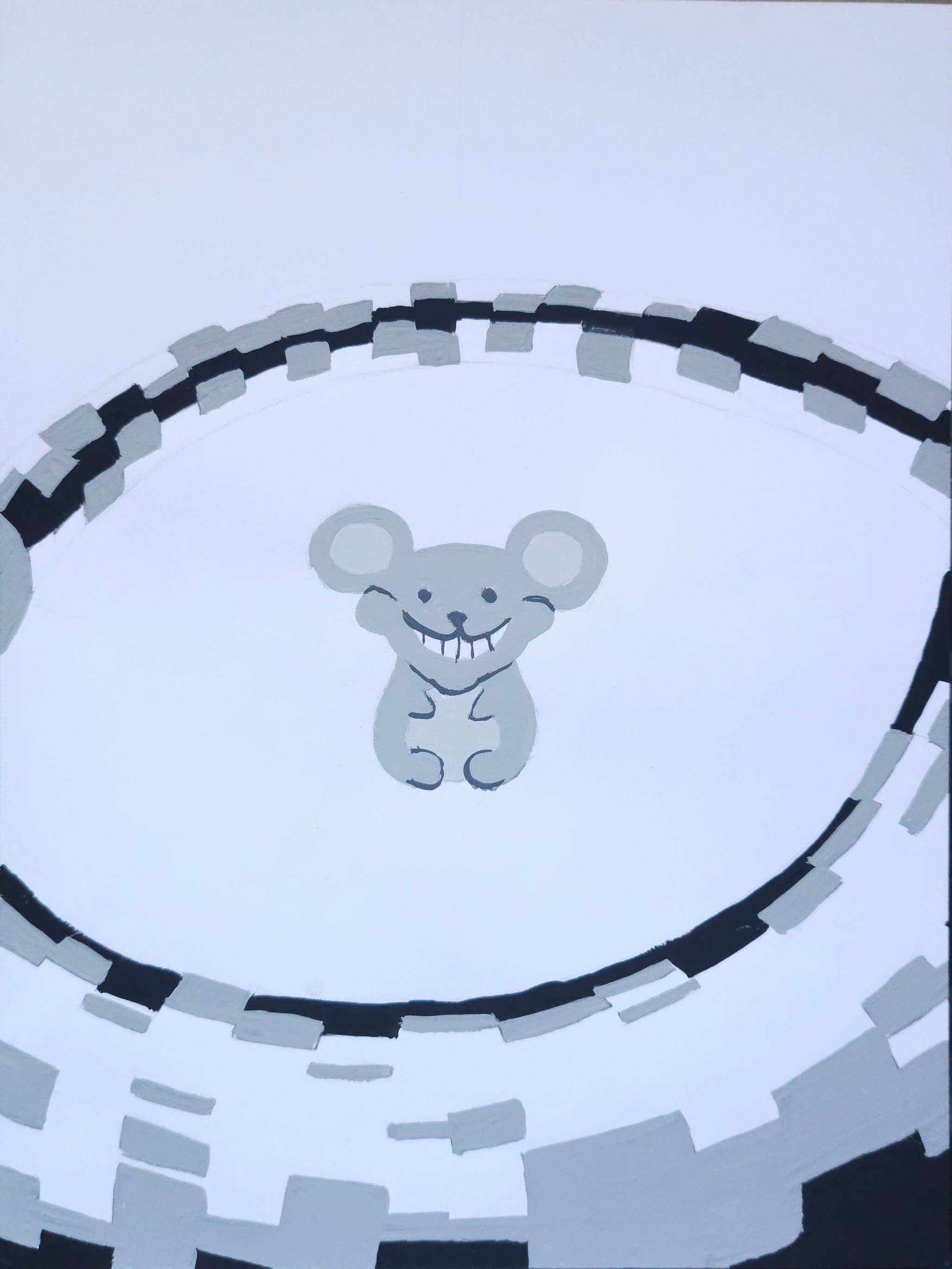
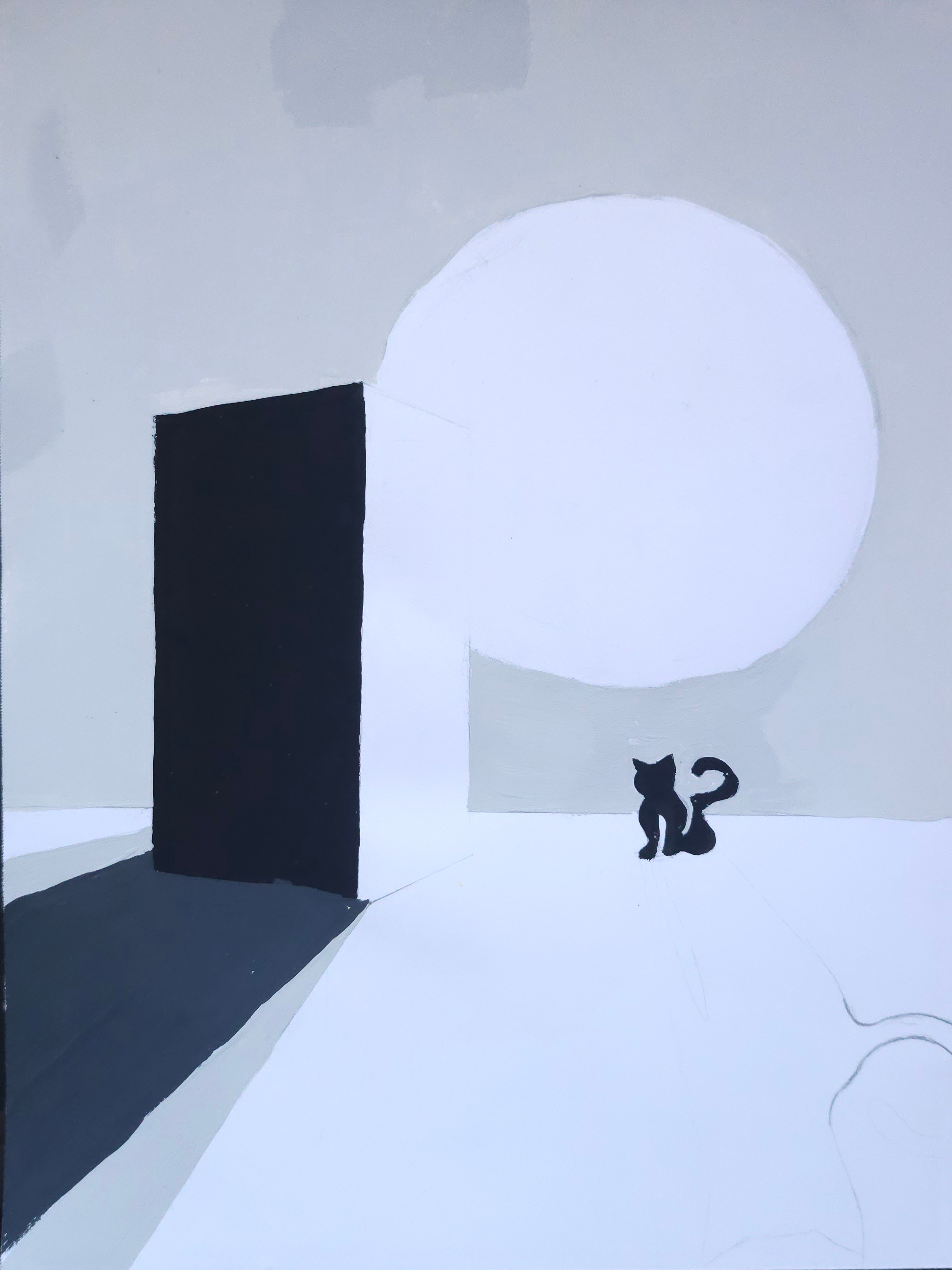
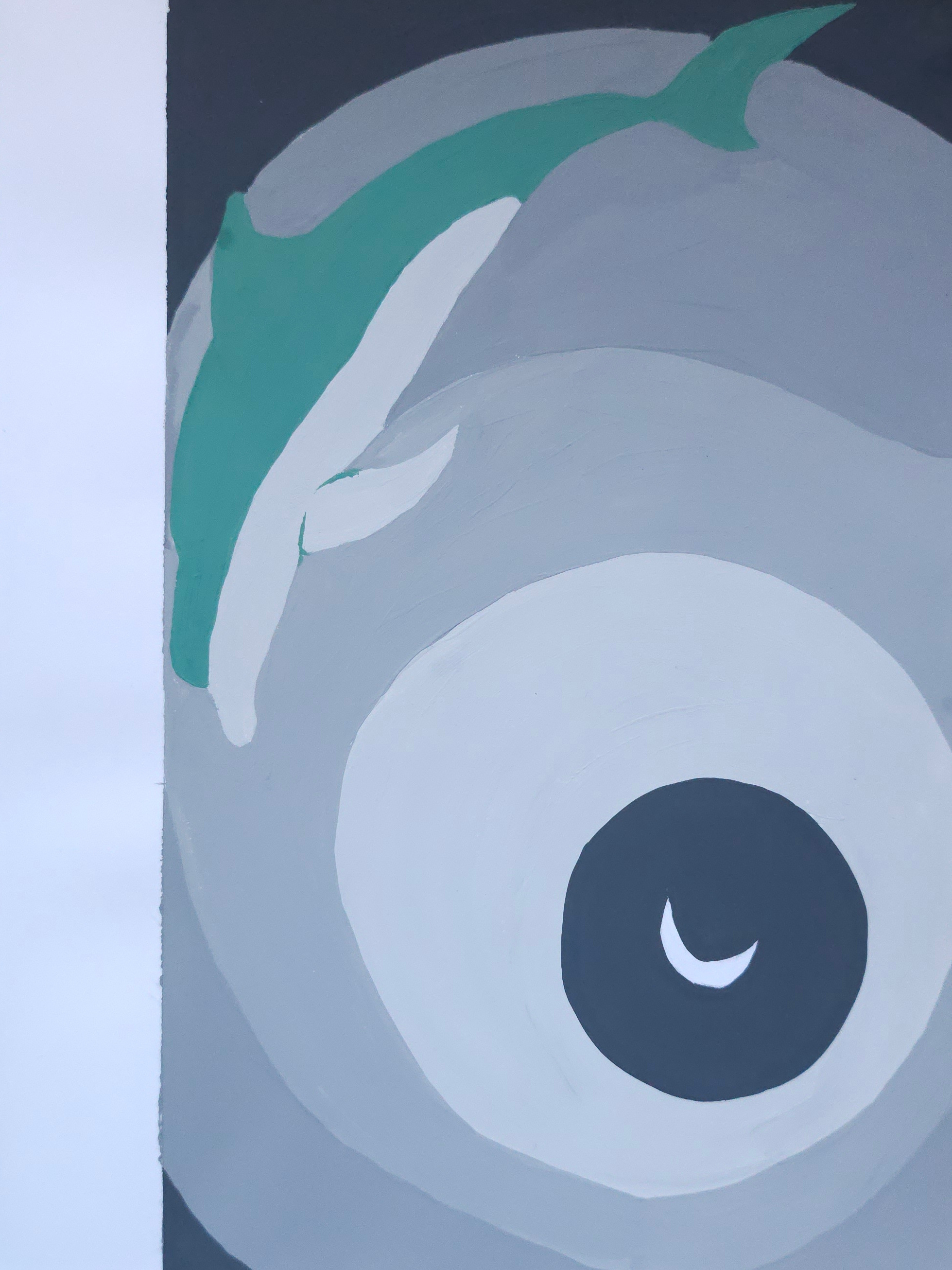
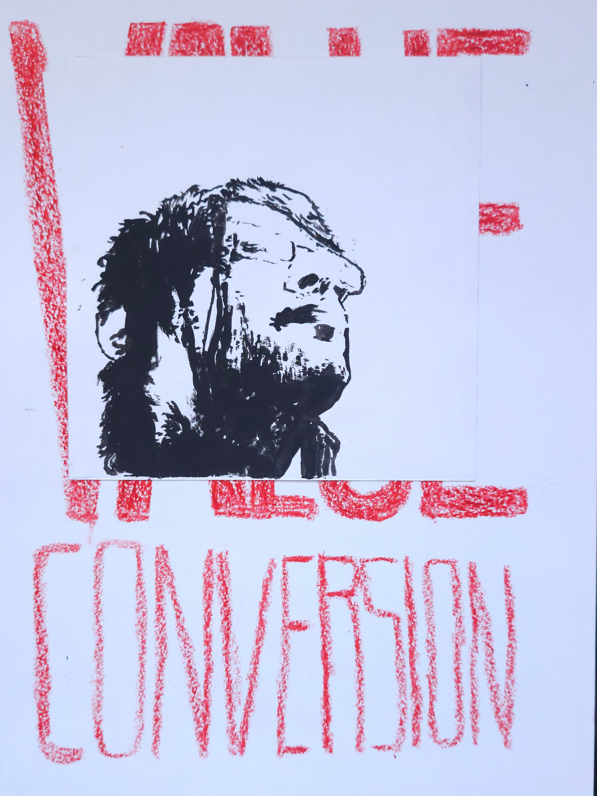
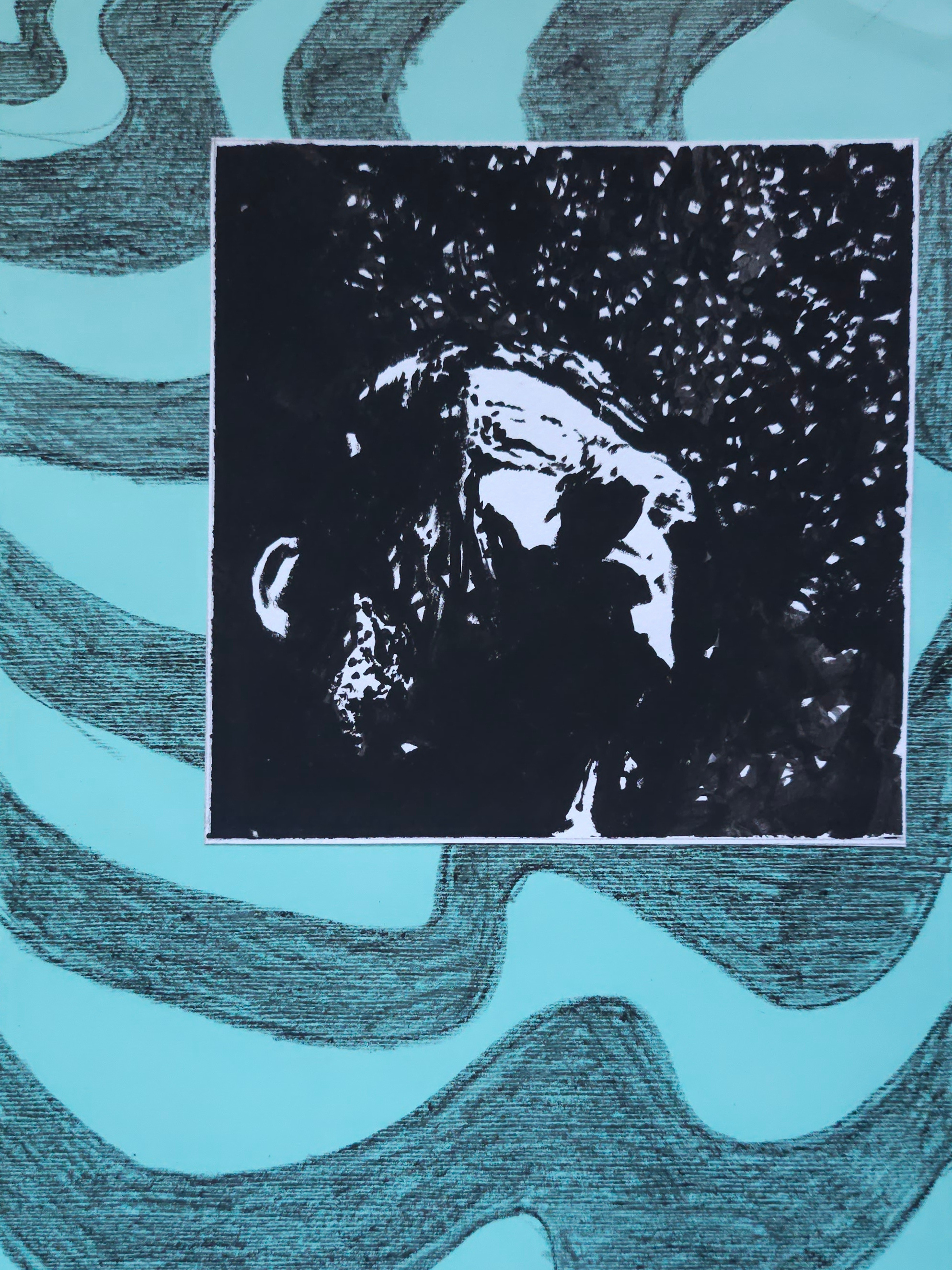
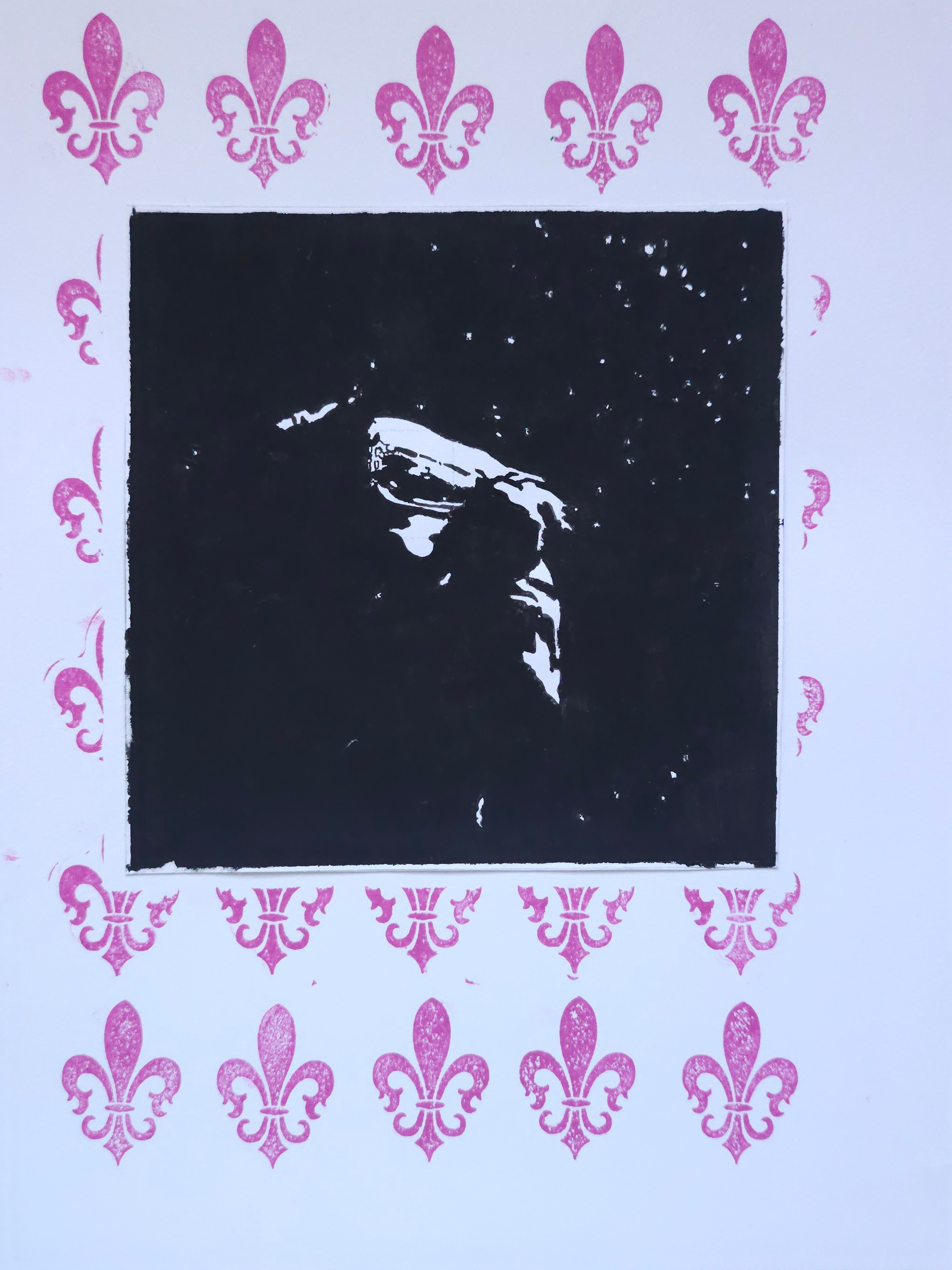
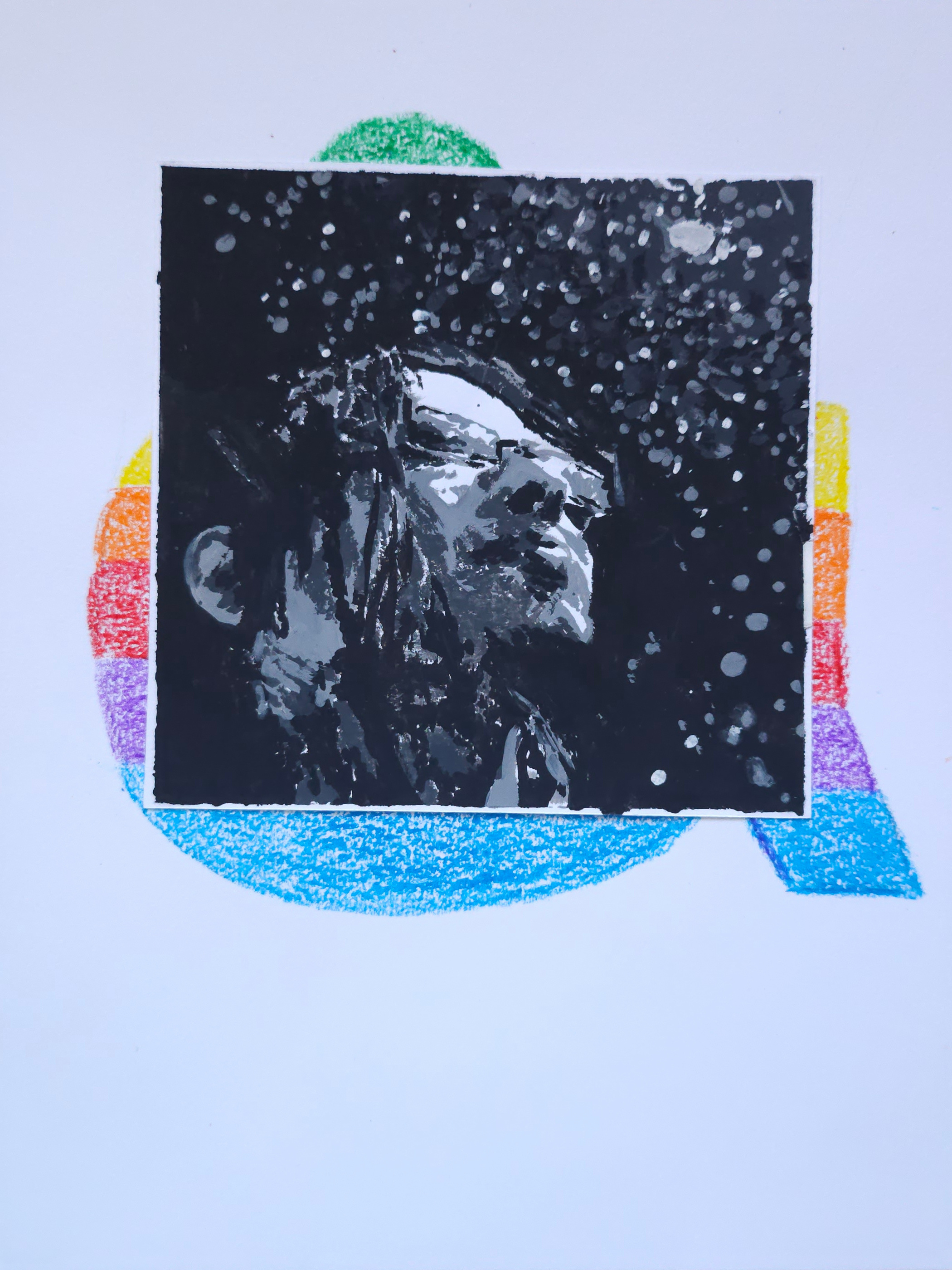
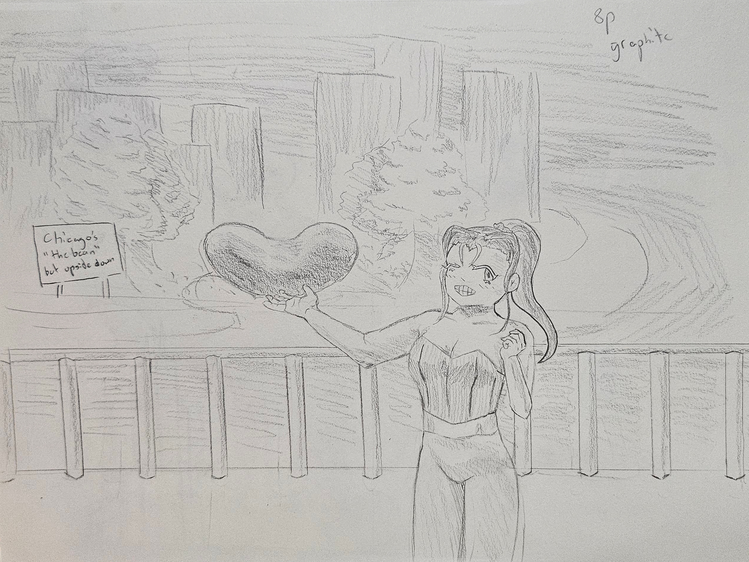
Character Design & Storytelling
The last section had my making comics. I enjoyed the character design process, specifically in making silhouettes for my "superhero" assignment. Panelling wasn't a particular focus of this section-that is the design of how to fit multiple frames of a comic into one page-but I realized how much I need to work on my panelling if I ever want to do any sort of comic style in my future designs.